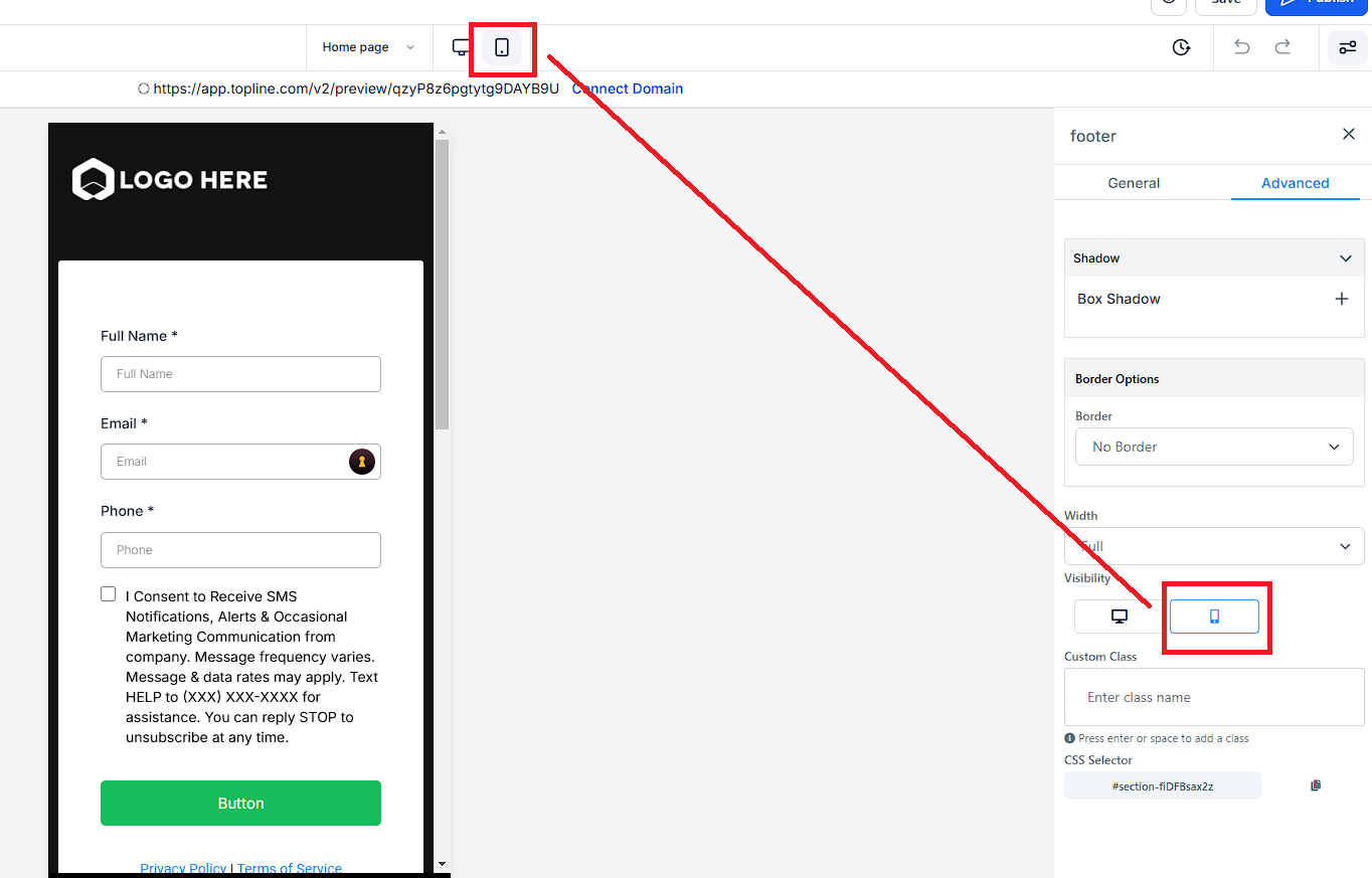
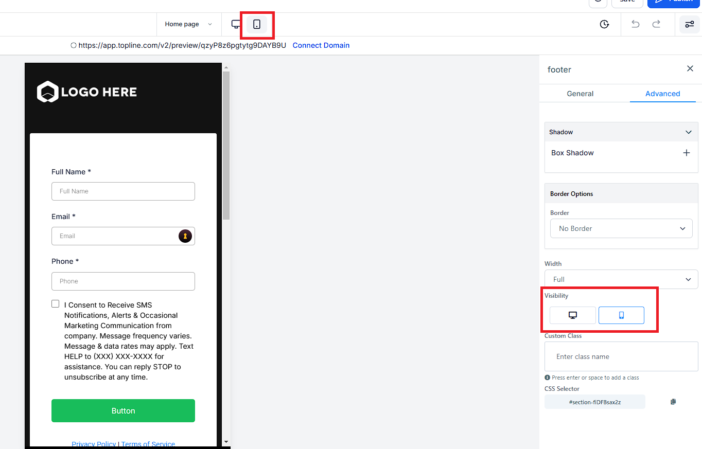
More than likely, you will find you need to create a unique section, row, column, or element for mobile view only. You can edit the visibility of your elements with the visibility setting. Select any object, go to settings, then advanced settings. This is very helpful when optimizing the look and feel of your desktop or mobile views for your site.
Every site builder has both a mobile and desktop view. Unless you edit an object, the desktop and mobile views will be identical. When you go to review your mobile view of your site, you will likely find some aspects of your site you wish to change or adjust for your mobile viewers. This makes sense, mobile and desktop screens are different sizes. So we will need to adjust how the mobile view looks to best suit mobile viewers. Let’s learn how to edit your mobile view below.
At the top of your editor, you will see a button for Desktop Mode and another called Mobile Mode. Selecting the “Mobile Mode” will toggle to the mobile view editor of your site.