All-New Component and Modern UI
Built on a new architecture inspired by the Highrise design system
Offers a cleaner, more compact layout
Delivers a faster and more seamless interaction experience
Per-Character and Word-Level Color Styling
The inline text editor now supports applying color at the individual word or character level
Enables precise, fine-grained control over inline text appearance
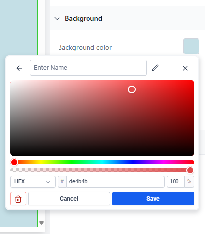
Single Unified Color View
Custom, default, and brand colors are now shown in one view
Eliminates the need to switch tabs, reducing friction in the design workflow
Label Editing for Custom Colors
Users can name and edit labels for custom colors
Improves color organization and reuse
Custom Label Tooltips
Hovering over a custom color displays its label as a tooltip
Makes it easier to distinguish similar shades
Support for HEX, RGB, and Custom Values
Save and reuse colors in multiple formats
View exact color values directly within the picker interface
Compact and Efficient Layout
Visually streamlined structure
Optimized for space and better alignment with the Highrise UI
Validation for Custom Value Origin
Custom colors must exist in the current location's configuration before being added
Ensures consistency across environments
Duplicate Value Prevention
Duplicate custom values are now blocked
Keeps palettes clean and avoids conflicts
Inline Text Color Copying via Global Sections
Fixed a long-standing issue where inline text color styles would not transfer through global sections or templates
Now, all custom inline styles including color values that are preserved accurately when reused across pages.
Go to Settings > Labs and enable “New color picker for Funnels and Websites.”
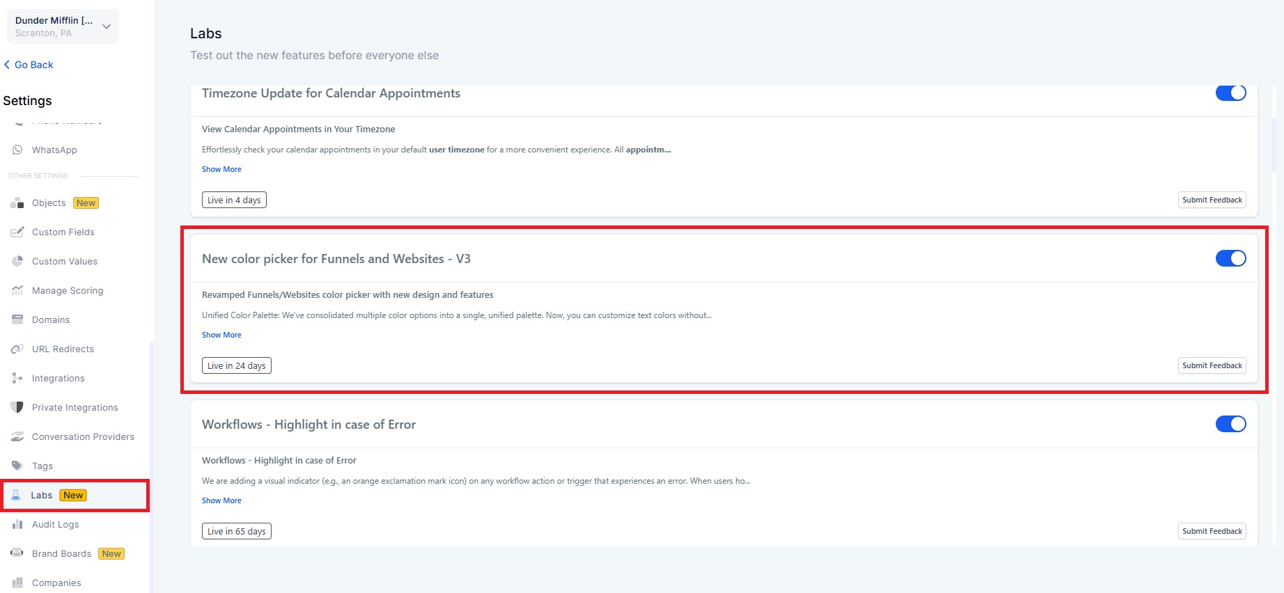
The new color picker is available in Labs now and will be gradually rolled out to all users over the next 20 days.
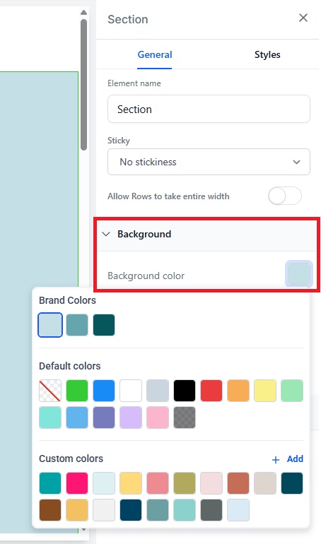
You can now customize the background color.