Topline OS adds height and width controls to the Page Builder. You can set fixed, auto, or responsive sizes for many elements, fine tune min and max limits, and keep sections aligned without custom CSS.
Height and width inputs for supported elements in the Builder
Size modes: Auto, Fixed (px), and Responsive (percentage or viewport where available)
Min and Max constraints to prevent awkward stretching or squishing
Per device controls so desktop, tablet, and mobile can have different sizes
Better alignment with grids and consistent card heights
Use min height to keep cards aligned when content length varies
Avoid fixed heights for text heavy blocks on mobile to prevent clipping
Combine width percentages with max width for flexible but readable layouts
Test on tablet and small phones, not just desktop, before you publish
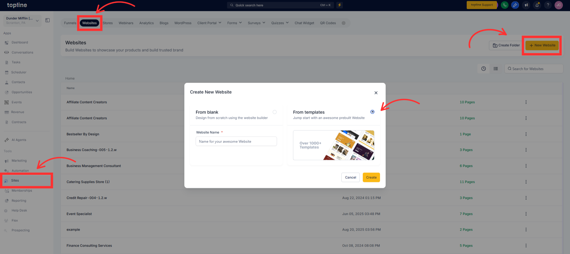
Step 1
Open the builder you need, for example Websites, Forms, Surveys, or Social.
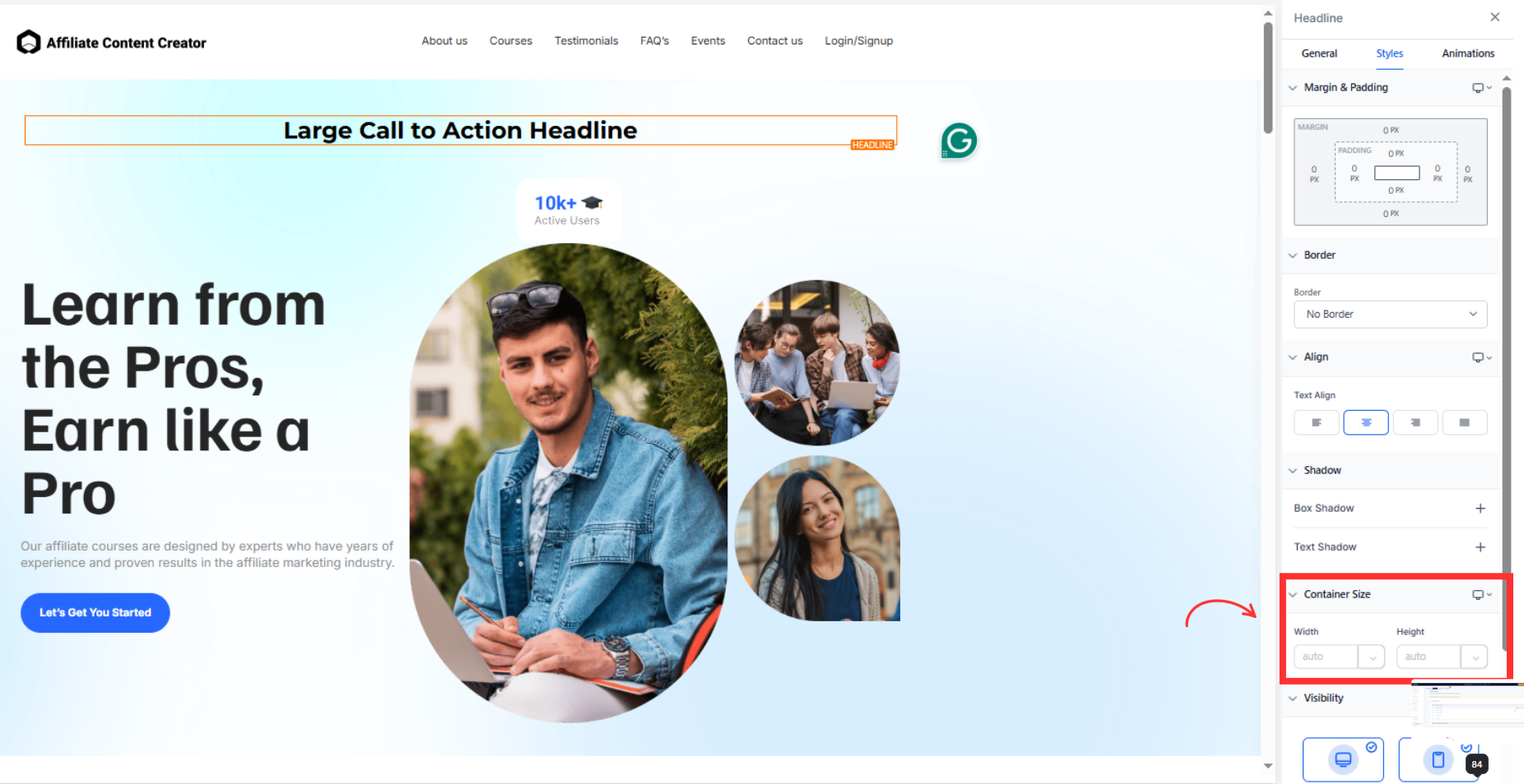
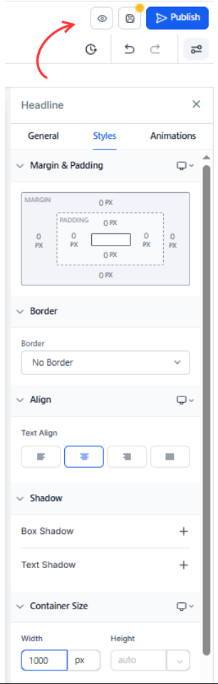
Step 2
Open the element’s Size or Layout panel and choose the size mode, for example Auto, Fixed, or Responsive.
Enter values for Width and Height. Add Min or Max limits if you need guardrails for different content lengths.
Step 3
Preview the page and adjust spacing or alignment so sections line up cleanly, then Save and publish.
Which elements support height and width controls
Common elements like images, containers, columns, and cards. Availability can vary by theme and element type.
What is the difference between Auto and Fixed
Auto lets content determine size. Fixed uses exact pixel values. Responsive uses percentages or viewport units.
How do Min and Max help
They keep elements from growing too tall or too wide, or from shrinking beyond a readable size.
Can I set different sizes for mobile
Yes. Use the device controls to override desktop sizes on tablet and phone.
Will fixed heights cause overflow
They can if content exceeds the set height. Prefer min height for text heavy areas, especially on mobile.