Topline OS adds a Bubble style for radio and checkbox fields in Forms and Surveys. Switch the style in the builder to get rounded, touch friendly controls with clear selection states that match your theme.
New Bubble style option for radio and checkbox elements in Forms and Surveys
Larger tap targets and rounded visuals for better usability on mobile
Theme aware colors and clear selected, hover, and disabled states
Works with stacked or inline layouts and respects spacing settings
Use Bubble style for mobile heavy audiences to improve completion rates
Keep labels short and scannable, especially when options are inline
Maintain sufficient color contrast between selected and unselected states
Group related options and add brief help text where choices need context
Step 1
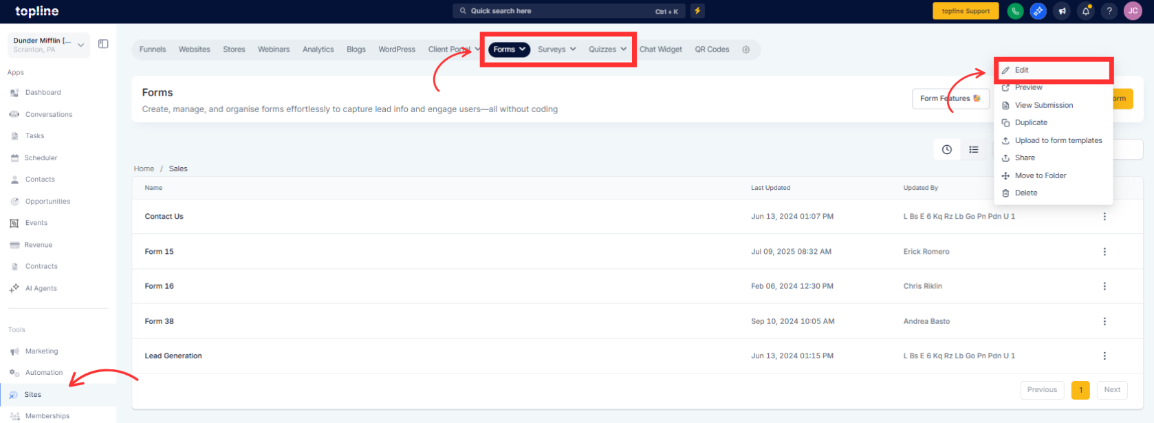
Open Sites and edit a Form, Survey, or Quizzes in the builder.
Step 2
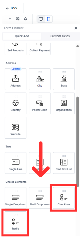
Select a Checkbox field to open its settings.
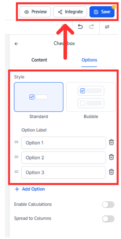
Step 3
Find Style or Appearance and choose Bubble. Adjust layout to Stacked or Inline, tweak spacing, and confirm theme colors look clear. Preview on mobile and desktop, then Save and publish.
Where can I use Bubble style
In Forms and Surveys on Radio and Checkbox elements.
Does Bubble style change my existing submissions
No. It only changes how the options look, not the data you collect.
Can I customize colors
The style follows your theme. Update form or page theme colors to change the look.
Will this affect validation or logic
No. Required rules and conditional logic work the same.
Can I switch back later
Yes. Change the Style setting from Bubble to the previous option anytime.