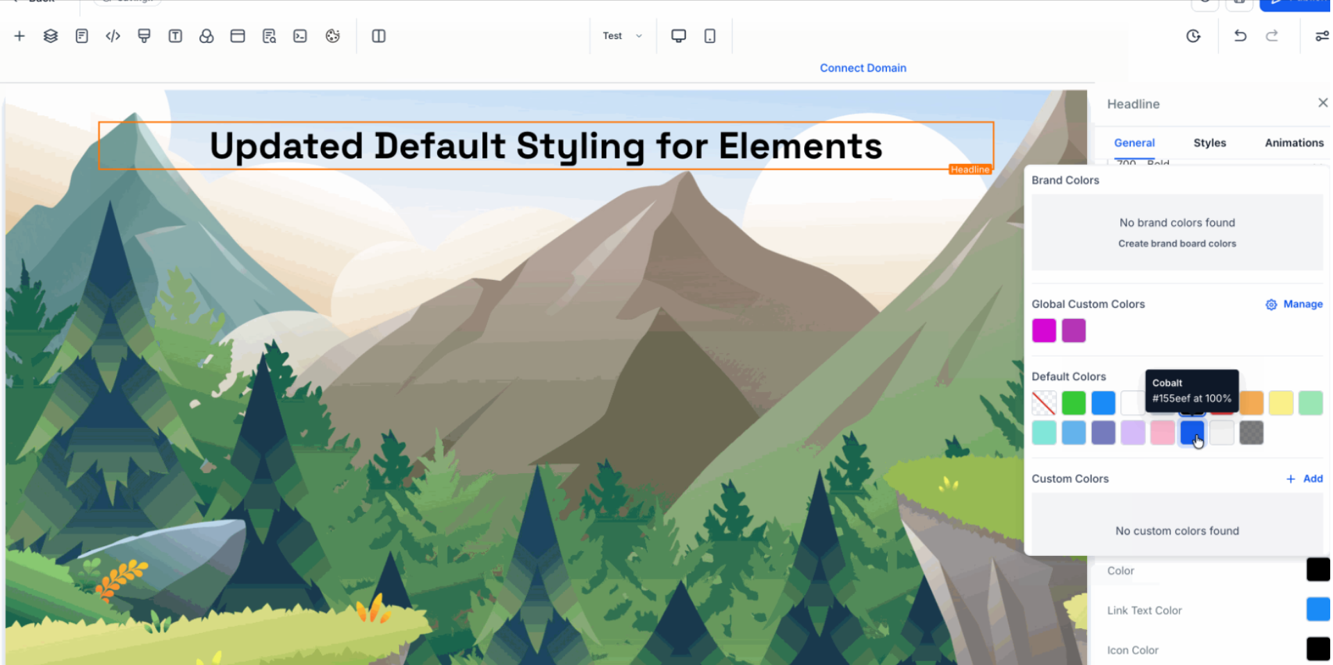
The Page Builder now ships with modern default styling for common elements. Headings, text, buttons, forms, containers, and media render with consistent spacing, accessible contrast, and responsive presets. New pages and newly added elements look great immediately, while legacy content can opt in through a guided update.
Modern typography scale with improved line heights and readable defaults
Consistent spacing system for margins and padding using a shared scale
Refined button presets with primary and secondary styles, radius, and hover states
Form inputs, labels, and focus states tuned for accessibility
Balanced container widths, section padding, and grid gaps for better layouts
Default link styling with clearer hover contrast and optional underline
Image and video elements with sensible sizing and lazy load defaults
Subtle shadows and borders to separate sections without clutter
Mobile first responsive rules across headings, containers, and media
Theme friendly color tokens to align quickly with brand palettes
Start from the default theme and adjust color tokens before deep styling
Use the spacing presets instead of custom values to keep layouts consistent
Prefer the default button variants and only override label text and size
Keep link underlines for long form content to improve clarity
Test forms with keyboard only navigation to validate focus states
Review pages at common breakpoints like 360, 768, 1024, and 1280
Migrate older pages section by section to avoid unexpected shifts
Step 1
Open the Page Builder and create a new page or choose an existing draft.
Step 2
Select the latest default theme or update your current theme to inherit new tokens and scales. Insert headings, text, buttons, forms, images, and containers to see refreshed defaults in action.
Which elements are affected by the new defaults?
Headings, paragraphs, lists, buttons, forms, containers, images, videos, and links with updated typography, spacing, and states
Do existing pages change automatically?
No, existing pages keep their current styling unless you opt in or apply the updated theme and confirm changes
Can I override the defaults?
Yes, element level settings and theme tokens allow overrides while keeping the base scale consistent
Are accessibility improvements included?
Yes, color contrast, focus indicators, and form states follow accessible defaults to improve usability
How do responsive rules work?
Mobile first breakpoints adjust font sizes, container widths, and gaps so layouts scale smoothly across devices