Featured product and collection blocks now include selection micro interactions. When shoppers hover, focus, or choose a product, variant, or quantity, the UI responds with lightweight animations, state highlights, and instant state syncing across cards. These cues reduce hesitation, improve accessibility, and help users understand what is active before they add to the cart.
Built in hover, focus, and active states for featured product and collection cards
Smooth transitions for selection highlights, borders, and background fills
Variant and quantity pickers with immediate visual confirmation
Synchronized state across cards to prevent multiple ambiguous selections
Accessibility friendly focus rings and readable contrast defaults
Performance-tuned animations that avoid layout shift
Theme-aware styling that respects your fonts and color tokens
Keep animation duration short for a crisp feel and faster perceived speed
Use high contrast active states so selections are unmistakable on mobile
Limit concurrent animations to avoid visual noise on busy collections
Pair selection feedback with a clear Add to Cart CTA
Test keyboard navigation to ensure focus styles are as strong as hover styles
Preview on low end devices to confirm smooth motion and no jank
Step 1
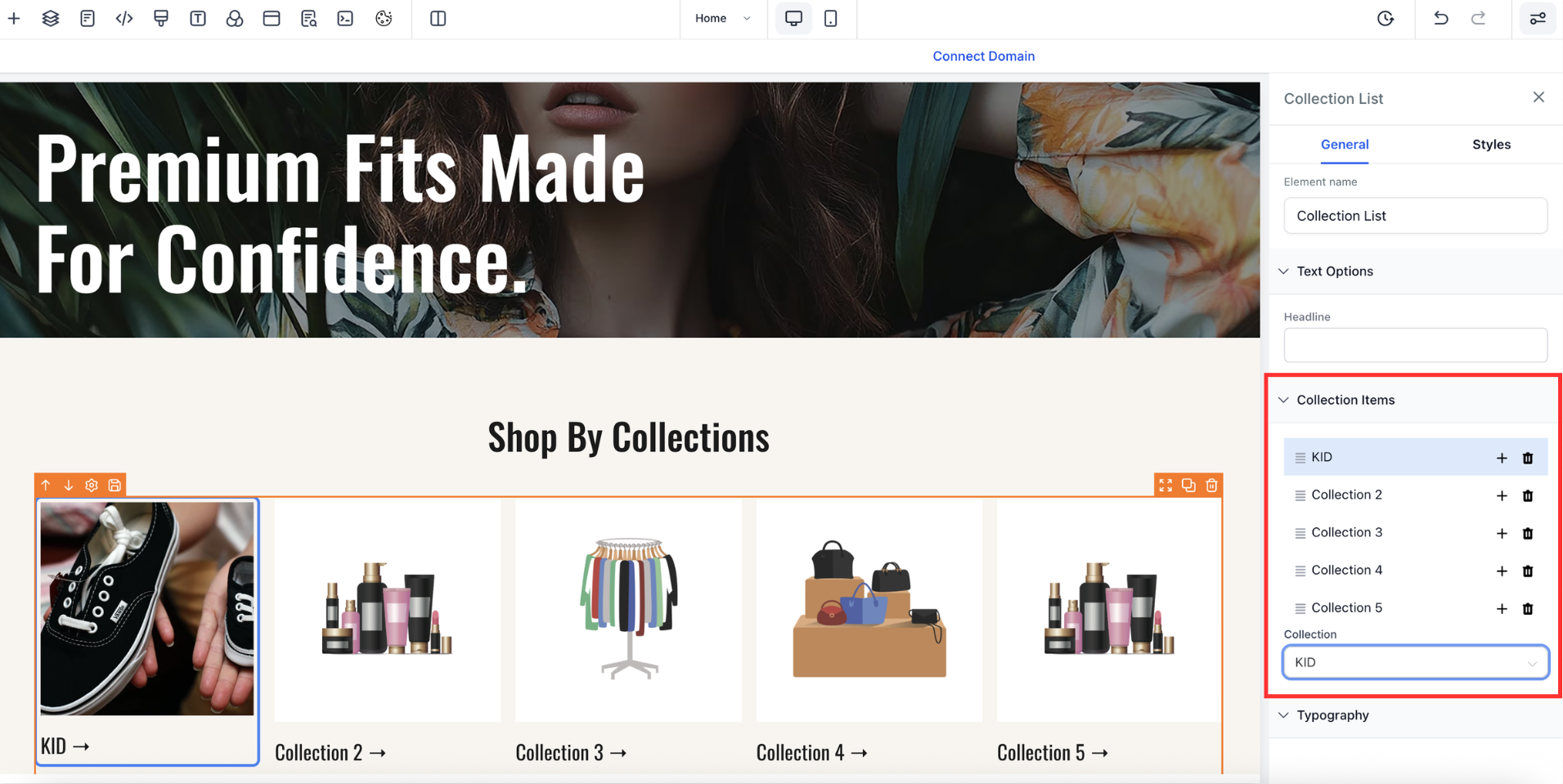
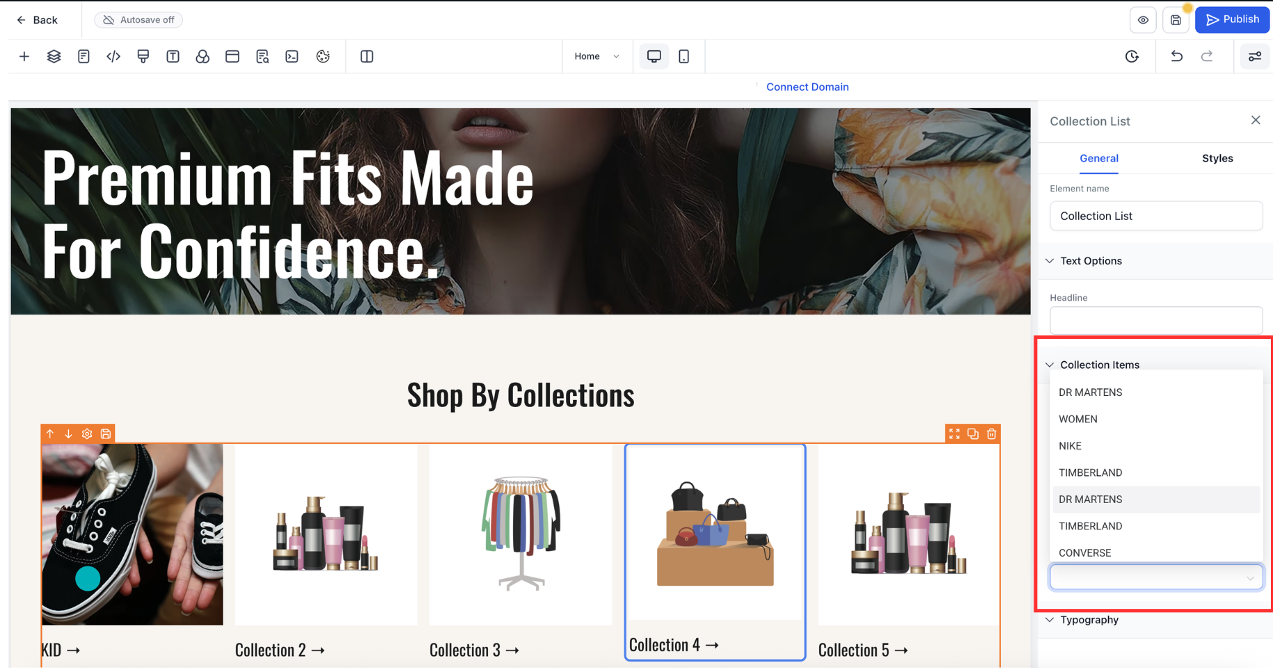
Open Sites or Store and edit the page with Featured Product or Collection elements, or create a new one.
Step 2
Select the element, open Styles, and enable Selection micro interactions.
Step 3
Choose presets for hover, focus, and active states, or switch to Custom to tune border, fill, and elevation. Configure variant and quantity picker feedback, such as checkmarks or badges.
What elements are supported?
Featured Product cards and Collection product tiles with built in hover, focus, and active states.
Do interactions respect my theme?
Yes, styles inherit your theme tokens for colors, fonts, and spacing.
Will this slow my page down?
No, animations are GPU-accelerated and tuned to avoid layout shift.
Can I customize the highlight style?
You can adjust border, background, elevation, and icon, or use presets.
Is keyboard navigation accessible?
Focus rings and contrast defaults meet accessibility guidelines.