The Form Builder now supports button icons. You can prepend or append icons to Submit, Next, Back, and custom action buttons, control alignment and spacing, and set responsive behavior. Accessibility settings, presets, and theme aware styling ensure polished, legible buttons across devices.
Icon support for Submit, Next, Back, and custom action buttons
Built in icon library plus custom SVG upload
Position controls for left or right with adjustable spacing
Size, color, and hover state options that follow theme styles
Responsive visibility and alignment settings
Accessibility options with aria labels and hidden from screen readers
Presets for common actions like send, save, and arrow icons
Use recognizable icons that reinforce the button label
Keep icon size slightly smaller than text height for balance
Prefer left aligned icons for primary actions to aid scanning
Avoid using icons without text to maintain clarity and accessibility
Test on mobile to ensure tap targets and spacing feel comfortable
Reuse presets to keep visual language consistent across forms
Step 1
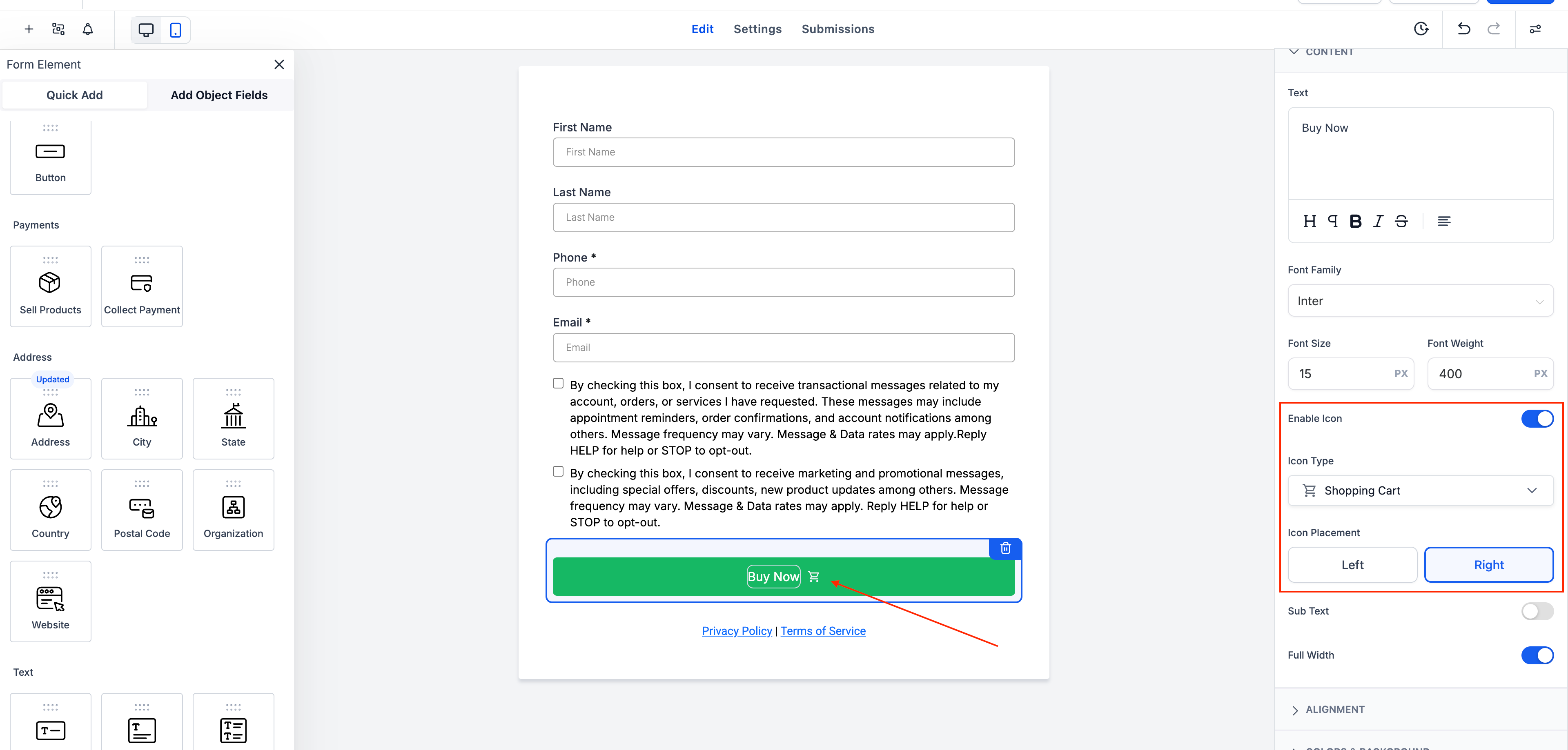
Open Forms and select the form with the button you want to edit.
Step 2
Click the button element, then open the Icon settings panel. Choose an icon from the library or upload a custom SVG. Set position to Left or Right, then adjust size, color, and spacing.
Which buttons support icons?
Submit, Next, Back, and custom action buttons in the Form Builder.
Can I upload my own icons?
Yes, upload custom SVGs in addition to using the built-in library.
Where can I position the icon?
Place the icon to the left or right of the button label with adjustable spacing.
Will icons match my theme styles?
Icon color and hover states inherit your theme tokens for consistency.
Is this accessible for screen readers?
Accessibility controls let you provide labels or hide decorative icons from assistive tech.