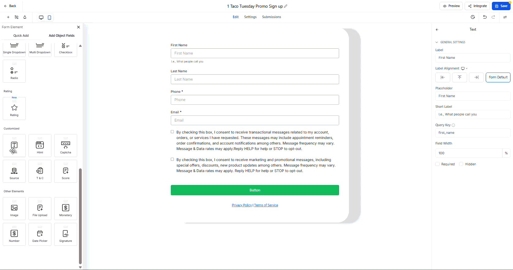
The builders now support an improved inline text editor, device specific styling, and mobile only text variants. You can format headings and text inline, set different styles for desktop and mobile without overwriting, tailor copy for small screens, and preview changes instantly to publish confidently.
Rich inline editor for headings, text blocks, and terms and conditions with bold, sizes, and colors
Separate desktop and mobile controls for background, padding, border, font weight, and more
Mobile specific text content to shorten headlines or tweak placeholders on small screens
Live preview across Forms, Surveys, and Quizzes to validate changes instantly
Create concise mobile headlines to prevent wrapping and boost readability
Use device toggles to fine tune padding and font sizes per device for visual balance
Keep color contrast high for accessibility, especially on mobile backgrounds
Preview frequently while editing to catch spacing and line height issues early
Standardize a few responsive presets for reuse across multiple builds
Step 1
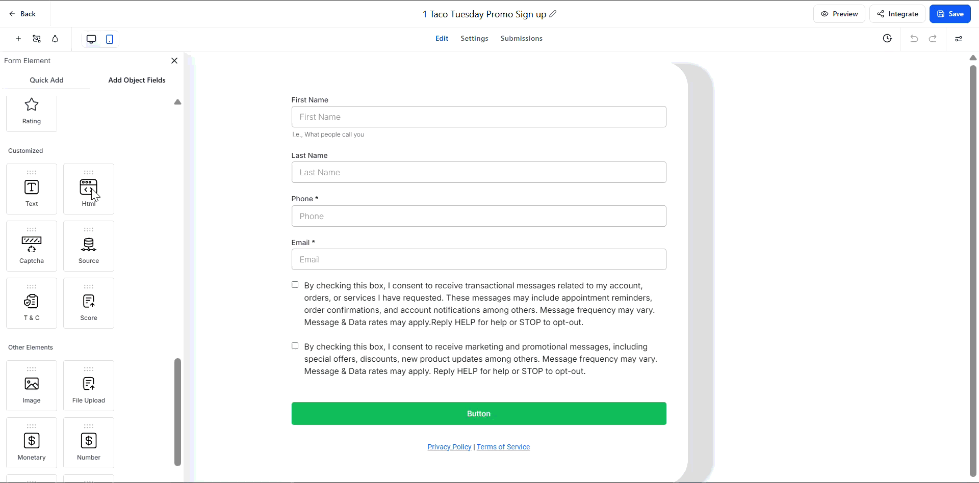
Open the Form, Survey, or Quiz builder and select a Text, Heading, or TnC element. Use the device toggle to switch between Desktop and Mobile.
Step 2
Edit text inline and adjust styles, including color, font size, weight, borders, and padding. Add mobile-specific text where needed to optimize short screen layouts.
What elements support the richer editor?
Headings, text blocks, and terms and conditions support inline formatting and device specific styles.
Do desktop changes overwrite mobile styles?
No, desktop and mobile controls are separate, so edits stay scoped to the selected device.
Can I write different text for mobile?
Yes, you can set mobile specific copy for clearer messaging on small screens.
Where do I preview changes?
Use the live preview inside the builders to see updates immediately for both device modes.
Which style properties are device specific?
Common options include background color, padding, borders, font size, and font weight.