The funnel builder can hide certain elements of your funnel builder so that it will only appear in one view.
However, we recommend that you avoid using these Mobile Only or Desktop Only sections, rows, columns, or elements (unless it's absolutely necessary). This feature often forces you to do double the work since the updates/revisions made on one view do not update on the other view (once an element is Mobile or Desktop only, edits or changes will be limited to one view, so you’d have to make changes twice).
That said, layout, spacing, and other structural changes require using Mobile Only or Desktop Only sections. As such, the recommendation is to build out the desktop version first and then in mobile view, determine which sections have to be altered.
Once you've determined those sections, you can duplicate them and then change one version to desktop only and the other to mobile only. You'll then be able to edit the mobile only as needed.
Step 1: Click the Edit icon on the funnel of your choice.
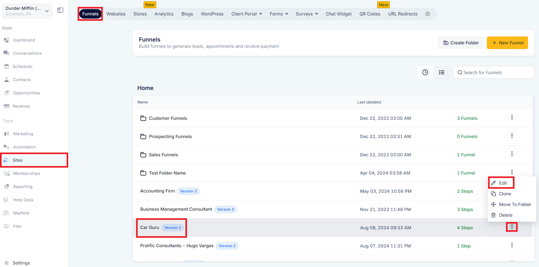
Step 2: Click the blue "Edit Page" button.
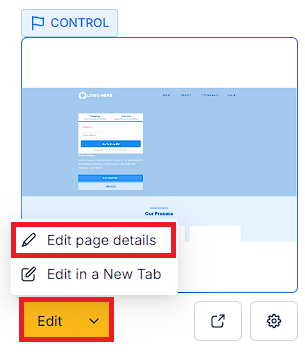
Step 3: Click on the element you want to edit.
Step 4: Under the element’s Settings, tab over to "Advanced".
Step 5: Under "Visibility", click on the desktop and mobile icons until blue to turn them both on.
.png?alt=media&token=eb26042e-5327-46a3-8b2d-a3aeb3906e18)
Step 6: Then, in the top menu bar, you can click the same desktop and mobile icons to view the optimized pages.
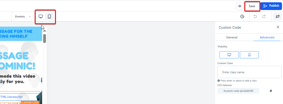
Step 7: Be sure to save changes before exiting.
.png?alt=media&token=85568134-6c89-4019-92b9-952c92913c15)
NOTE: Font sizes are the only elements that can have simultaneous settings (desktop font size and mobile font size).
To leverage the new Margin left and right option for column elements effectively, follow these steps:
Access the Funnel/Website Builder:
Log in to your CRM account and navigate to the Funnel/Website Builder section where you want to apply the column spacing adjustments.
Select the Desired Column:
Identify the column or columns for which you want to adjust the spacing.
Open Column Settings:
Click on the column element to open its settings menu.
Navigate to Advanced Settings:
Within the settings menu, locate the "Advanced" tab or option.
Activate Margin left and right:
Under the "Advanced" settings, look for the Margin left and right option. Toggle this option to enable it.
Adjust Spacing:
Once the Margin left and right option is activated, you'll typically see input fields or sliders where you can specify the desired amount of spacing. Adjust these values according to your design preferences.
Preview and Fine-Tune:
After adjusting the spacing, preview your funnel or website to see how the changes affect the layout. Fine-tune the spacing as needed to achieve the desired visual balance.
Save Changes:
Once you're satisfied with the spacing adjustments, be sure to save your changes to apply them to your funnel or website.
Repeat as Necessary:
If you have multiple columns that require spacing adjustments, repeat the above steps for each column as needed.
.png?alt=media&token=b9372eaf-62e9-480a-b0d0-bbc773bf015d)
By following these steps, you can effectively utilize the Margin left and right option to enhance the visual appeal and layout of your funnel or website, ensuring a seamless user experience for your visitors.