The Email Builder Inline Editor is a powerful tool embedded within our Templates and Campaigns platform. It eliminates the complexity of email design and formatting, offering a user-friendly interface for effortless customization.
This editor operates on the principle of WYSIWYG, providing real-time previews as you make changes. Whether it's bolding a sentence, inserting an image, creating an image through AI, or changing the color of a heading, the editor displays the final email appearance instantly.
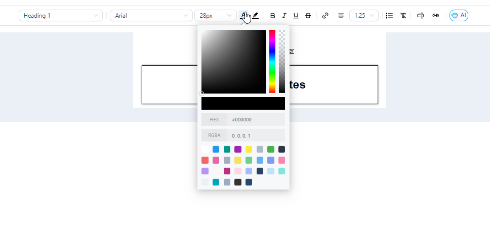
The Inline Editor supports various customization features. Users can choose from multiple heading and paragraph formats, select supported fonts, adjust text sizes, and apply colors using hex codes for precise selection. Formatting options such as bold, italic, underline, and strikethrough, along with hyperlink integration, enhance the email's visual appeal.
Moreover, the inline editor allows for custom values, giving you better control over your content. The tool also supports AI-assisted content generation, which can help you create engaging email content faster.
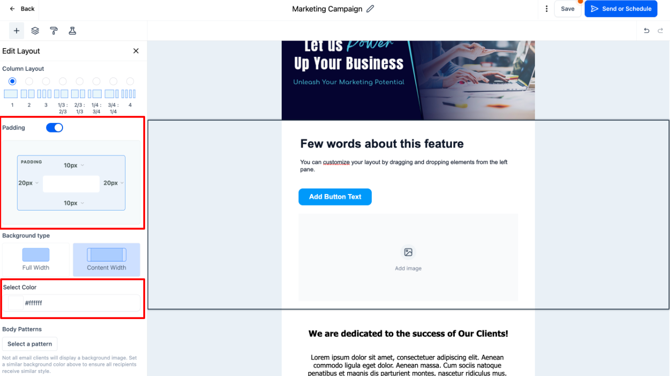
To maintain uniformity, default padding settings have been implemented. These settings include top padding , bottom padding , left padding , and right padding , ensuring consistent spacing around the content.
Top Padding: 10
Bottom Padding:10
Left Padding: 20
Right Padding: 20
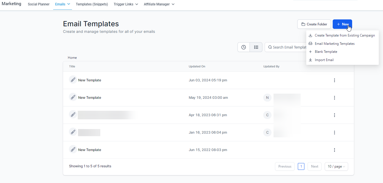
Navigate to Marketing > Emails > Templates
Here you can create a new template or edit an existing one.
Upon accessing the Email Builder, you will be greeted by a sleek, intuitive user interface. The toolbar at the top offers essential functionalities:
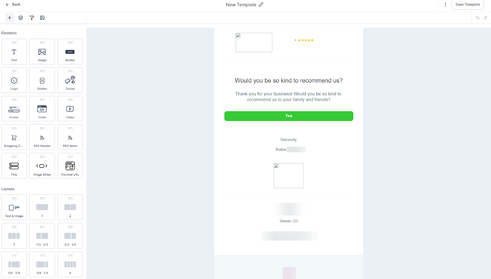
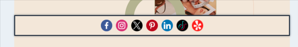
The 'Add Elements' Icon: Introduces new content into the email, from text and images to complex structures such as Social, which you can use to display all of your social networks.
.png?alt=media&token=c7772138-21ab-4100-861c-a868436cab82)
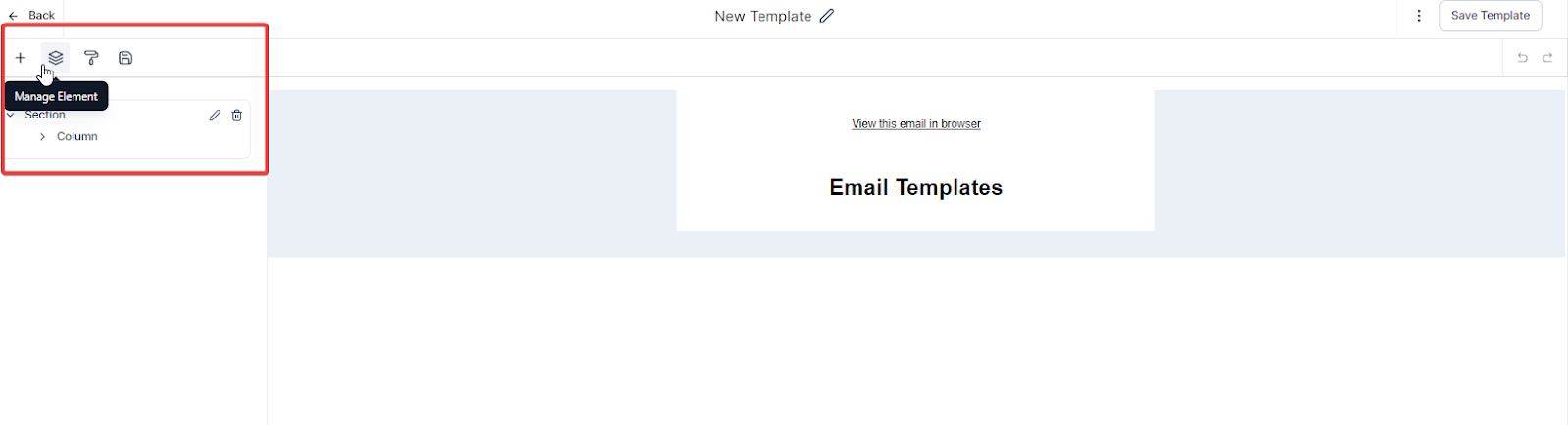
The 'Manage Elements' option: Provides an overview of all elements, enabling easy selection and adjustment. For example the Social element which you can use to display all of your social networks.
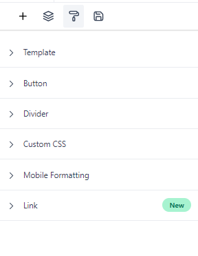
The 'Appearance' setting: Allows control over the global style, including background color, divider, custom CSS styling, and mobile formatting.
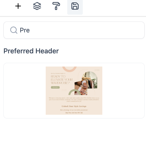
You can also quickly access your saved items inside the email builder using our recent release of the search bar. Save time by reusing popular components without the need to recreate them from scratch and easily locate and manage saved elements, improving workflow and design consistency.
These functionalities are designed to give you complete control over your email's design, from the individual components to the overall look and feel.
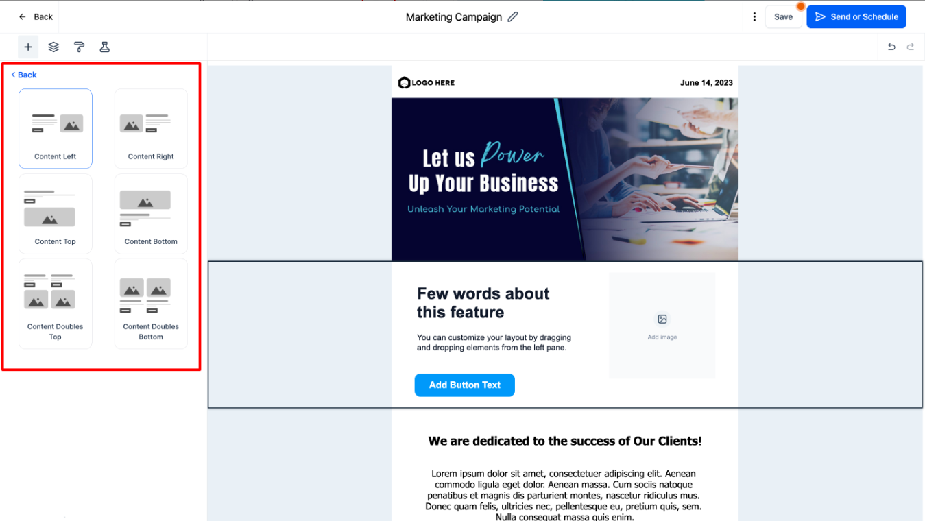
The Email Builder offers various layouts catering to diverse content needs:
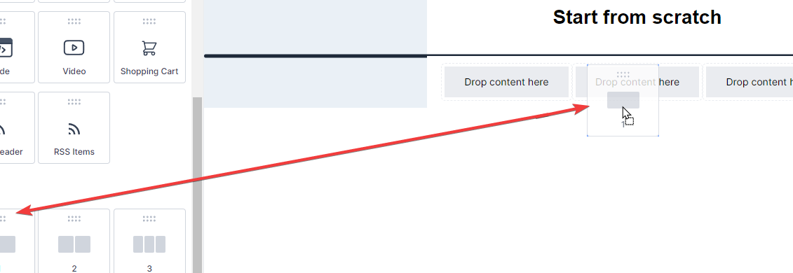
Click on the Add Elements tab to drag and drop the Layouts onto the page so you can drop the Element into any existing layout
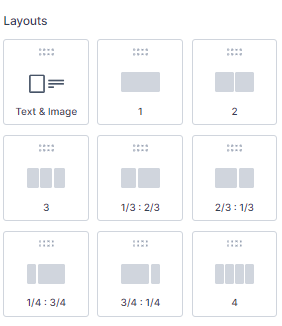
Here's a detailed explanation of each layout:
1: This layout represents a single-column structure. All content is placed in one straight vertical line. This is the most basic and one of the most common layouts used in emails. It's great for readability, especially on smaller screens such as mobile devices.
2: This layout corresponds to a two-column structure. Your email content is divided into two vertical columns. This layout is ideal for displaying two groups of content side by side, like an image and a text block or two articles from an RSS feed.
1/3: 2/3 and 2/3 : 1/3: These layouts represent a structure where the content is divided into two unequal columns. In 1/3: 2/3, one column takes up 1/3 of the width, and the other takes up 2/3. It's reversed in the 2/3: 1/3 layout. These are great for highlighting one piece of content more than the other, like an image and an accompanying description where the image is the main focus.
1/4: 3/4 and 3/4 : 1/4: Similar to the above, but here one column takes up 1/4 of the space, and the other takes up 3/4, and vice versa. This layout is useful when one piece of content is significantly more important than the other, such as a small navigation menu alongside a large content area.
4: This layout refers to a four-column structure. Your email content is split across four equal vertical columns. This is useful for presenting multiple pieces of content of equal importance side by side, like a grid of images or multiple articles from an RSS feed.
These layouts offer various ways to structure and present your content, depending on your specific needs and the type of email you're sending. By understanding the different options, you can choose the most effective layout for your email.
To add any of these elements to your email, drag and drop them onto your canvas. When you select an element for editing, the Inline Editor will pop up, providing numerous options to modify your chosen element to fit your requirements.
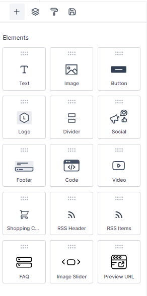
Here is a comprehensive list of content types you can add to your email:
Text: This versatile element can be used for headings, paragraphs, captions, and more. With the inline editor, you can fine-tune every text aspect, from the font style to the color and alignment.
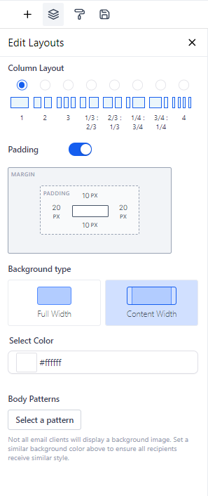
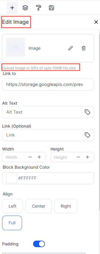
Image: If you want to include photos, graphics, or any other visual content, the Image element is the tool you need. You can upload images directly from your computer or link them from an external source.
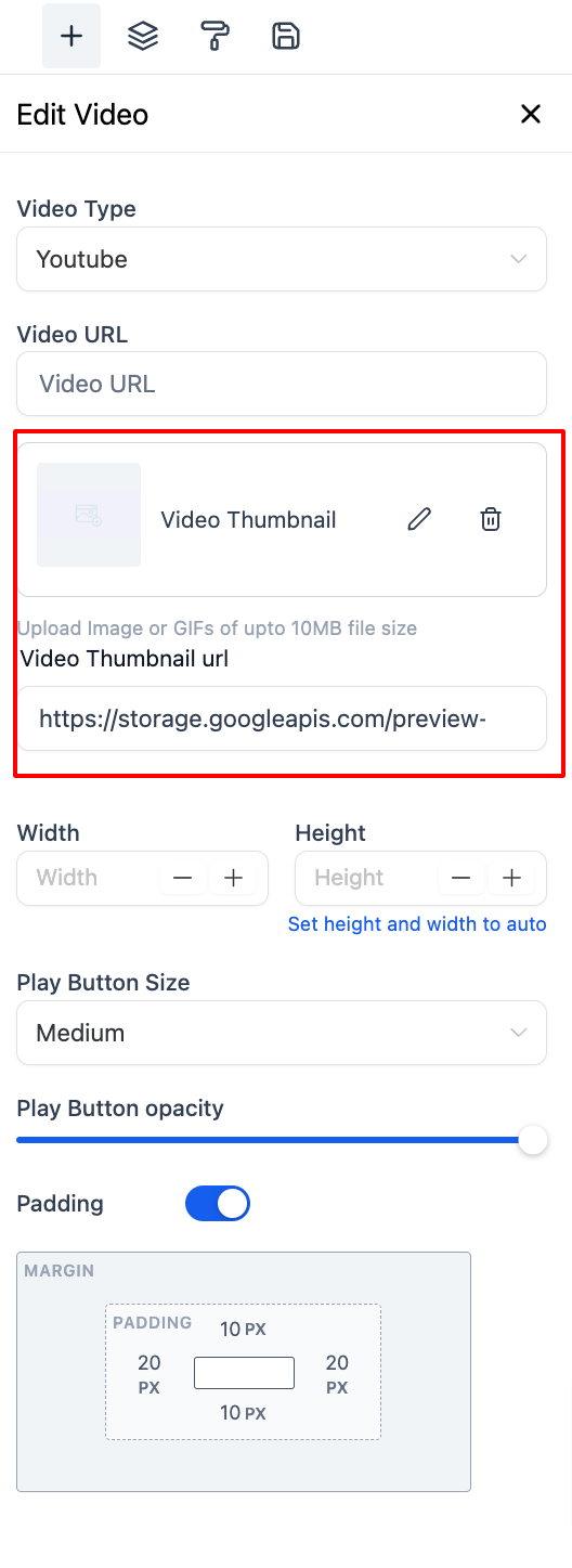
You can now add GIFs, up to 10MB, to your email builder. Additionally, GIFs can be used as video thumbnails, enhancing the overall user experience.
Button: Enhance user interaction with the Button element. You can link to a webpage, start a download, or trigger any other click-based action.
Note: Enter the text you want to display on your button. For instance, you might use 'Follow Me' to invite readers to follow a link to your social media page
Divider: The Divider element allows you to introduce clear separations between different sections of your email. Customize the color, width, and style to fit your design.
Social: Want your recipients to visit your social media profiles? The Social element lets you easily include icons linked to various social media platforms.
Footer: Use the Footer element to include essential information like contact details, company address, or unsubscribe links.
Code: Need more advanced features? The Code element allows you to insert custom HTML code directly into your email. This is where you input your custom code. This allows you to create more advanced layouts and components within your email.
Note: The Code block is intended for users who are proficient in HTML. As a precaution, we recommend familiarizing yourself with the essentials of HTML before using this feature. For guidance, you might find these resources helpful:
https://www.w3schools.com/html...
https://www.codecademy.com/lea...
Video: Engage your recipients with multimedia content. Insert a Video element and link it to your hosted video content. Video Thumbnails can have a GIFS
Shopping Cart: If you're in the e-commerce industry, the Shopping Cart element is a handy tool for including product details, pricing, and direct links to your online store. It's a way to remind them of the products they're interested in and encourage them to finalize their purchases.
RSS Header: The RSS Header block in the email builder is a powerful tool that allows you to dynamically populate the <channel> tags from your RSS Feed in your email campaign.
RSS Items: When dealing with RSS feeds, the "RSS Items" element is a crucial part of an email builder in email marketing platforms. It essentially works as a dynamic content placeholder that populates content from the RSS feed into your email campaign. The RSS items can range from blog posts, news updates, articles, or any published content accessible through an RSS feed.
FAQ Element: The FAQ element in your email allows you to create interactive accordion-style sections, providing a dynamic way to present frequently asked questions and their answers. Users can click on the accordion headers to expand and collapse the content, enhancing user experience and engagement.
Product Element: The Product element transforms your emails by incorporating visually engaging product catalogs. This feature provides a variety of benefits, from enhancing visual engagement to boosting conversion rates and strengthening brand identity.
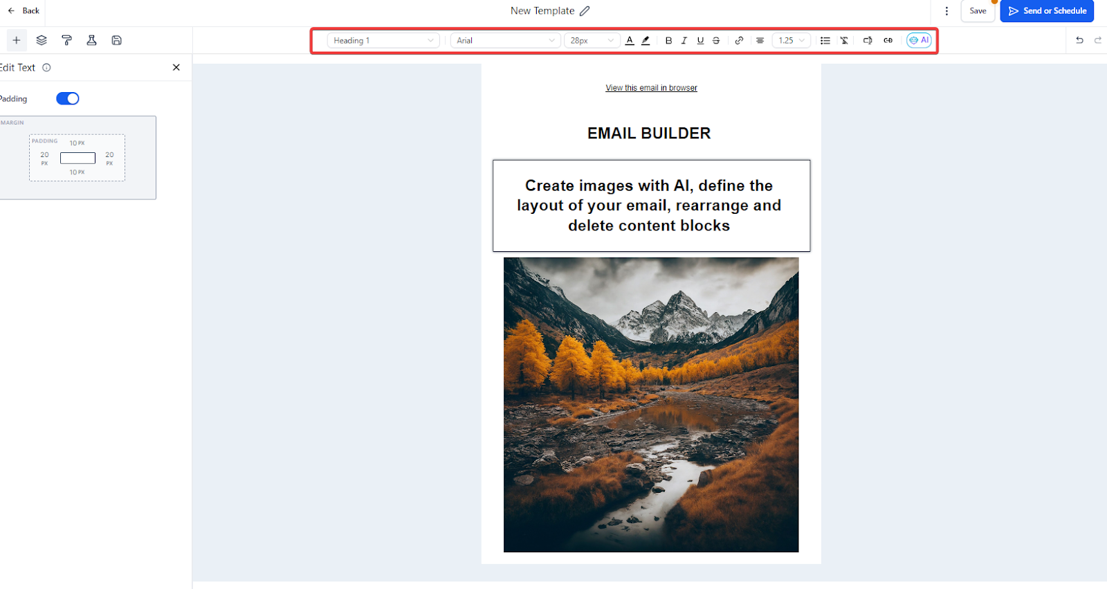
An inline editor is a powerful tool that lets you easily manage text and its formatting. When you highlight any portion of text, a range of options becomes available in the editor.
You can change the heading type.
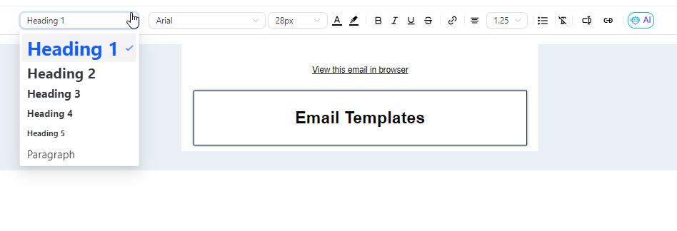
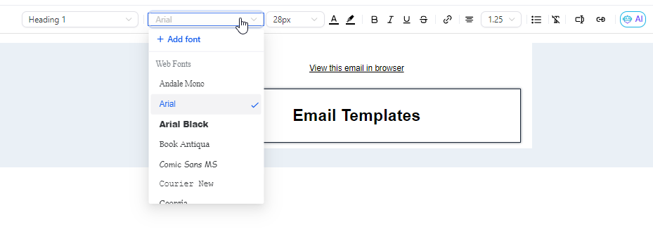
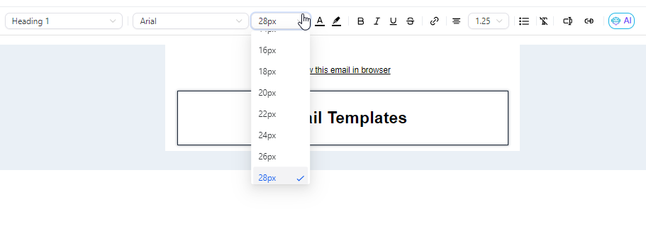
Select a different font, adjust font size, and modify the text color
It doesn't end there - options for bold, italic, underline, and strikethrough are also available
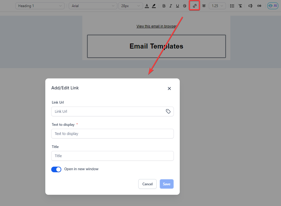
If you wish to add a hyperlink to your text, the inline editor allows you to do so, giving you control over its display text and target URL.
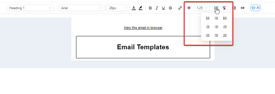
You can also adjust text alignment and line height or introduce bullet points to your text.
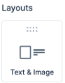
You can access the Image and Text Layout through Marketing > Emails > Templates/Campaigns.
You have the flexibility to choose a template or start from scratch.
The layout option includes the ability to add images, text, and buttons together.
Once the Image and Text Layout is added to the Builder area, select your preferred layout design.
Customization options are available, including selecting padding and background colors, streamlining the email creation process.