Access the Form Builder
Navigate to the Form Builder from your dashboard.
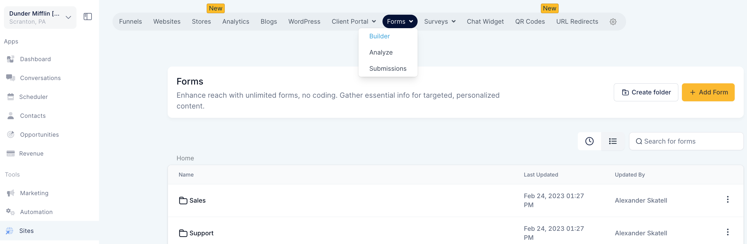
Select the form you want to customize or create a new form.
NOTE: Activate the new form builder UI by navigating to Account Settings, going to Labs, and turning on the "UI Revamp of Form Builder" toggle switch.
Adding Form Elements
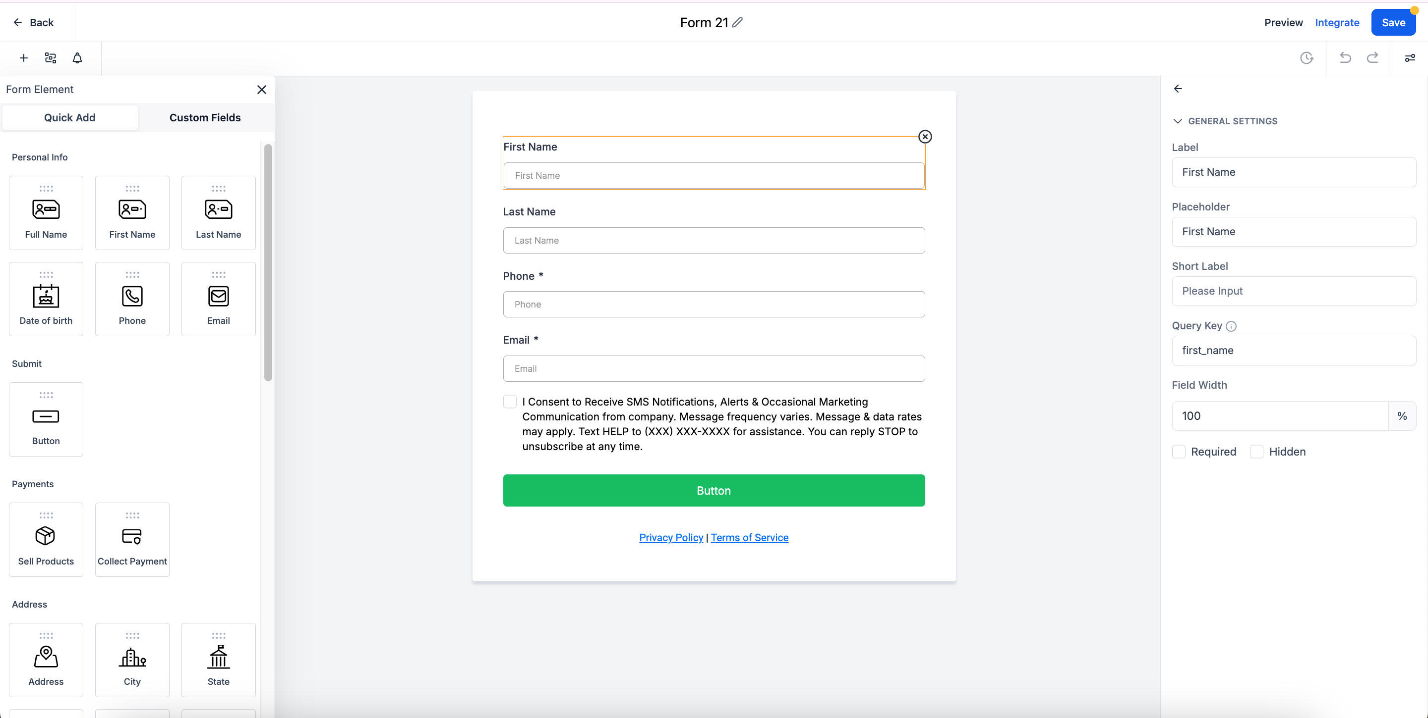
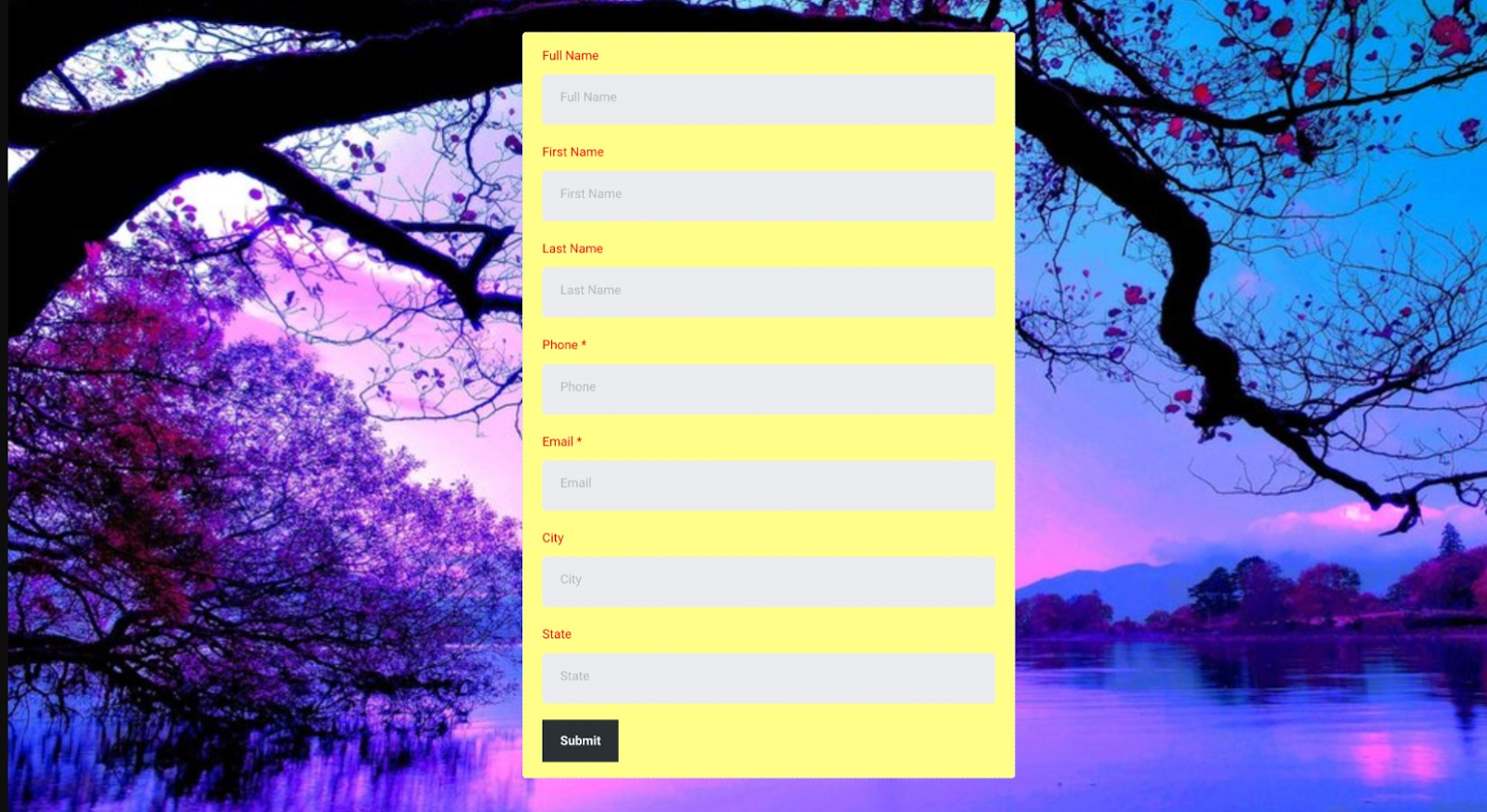
Standard and Custom Fields: Add fields from the left panel. You can choose from standard fields like text boxes and drop-down menus, or add custom fields as needed.
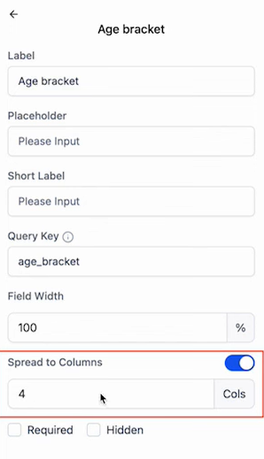
The Spread to Columns feature for forms allows the configuration of multiple columns for radio buttons, radio images, and checkboxes, enhancing the visual styling and layout. This functionality improves the organization and presentation of forms, making them more user-friendly and aesthetically pleasing. To utilize this feature, navigate to the form or survey editor, select the radio buttons or checkboxes, and adjust the column settings in the right-hand menu. This feature applies to new forms and does not affect existing ones.
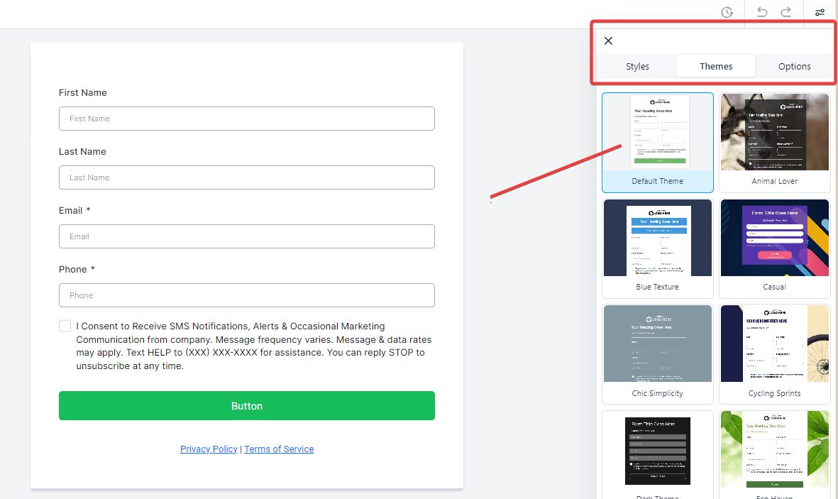
Styling, Themes and Design Tools: All styling, design through various themes, and option tools are located on the right panel. Here, you can adjust the appearance and behavior of each form element.
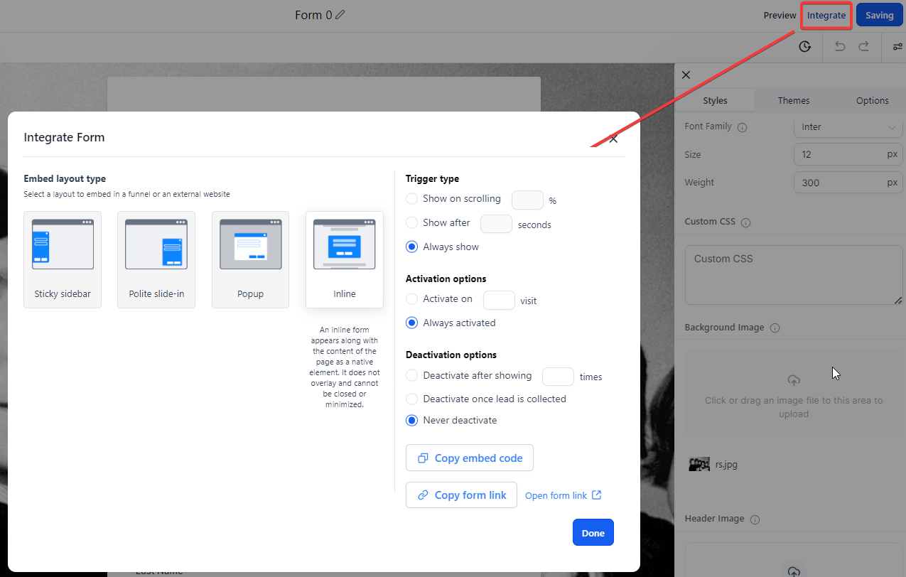
Take advantage of multiple integration options to seamlessly connect your forms with various tools and services, enhancing their functionality and efficiency.
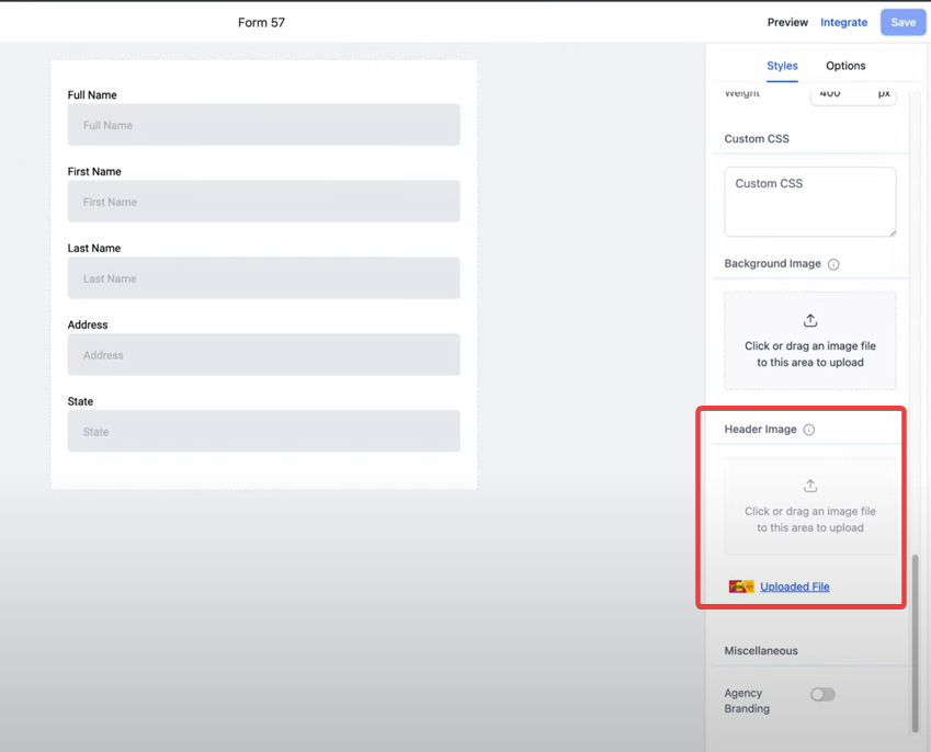
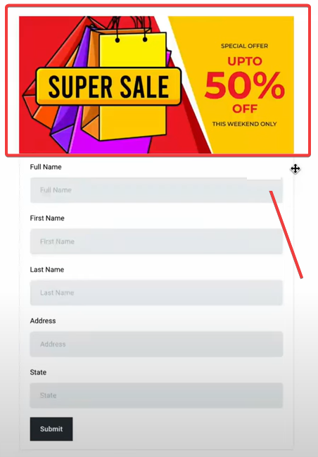
Header Image Support
Upload Header Images: Go to the Styles section and upload your desired header image. This image will span the width of the form, positioned at the top for better visual presentation.
Background Image Support
Add Background Images: In the Styles section, upload a custom background image to cover the entire page of your form. This feature enhances the visual engagement of your forms.
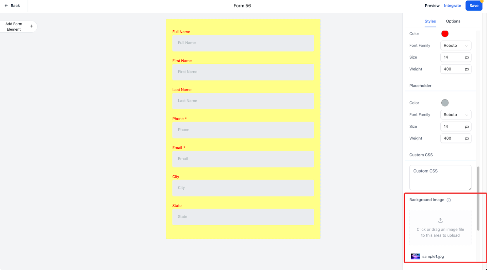
Preview: Use the preview option to see how your form looks with the background image.
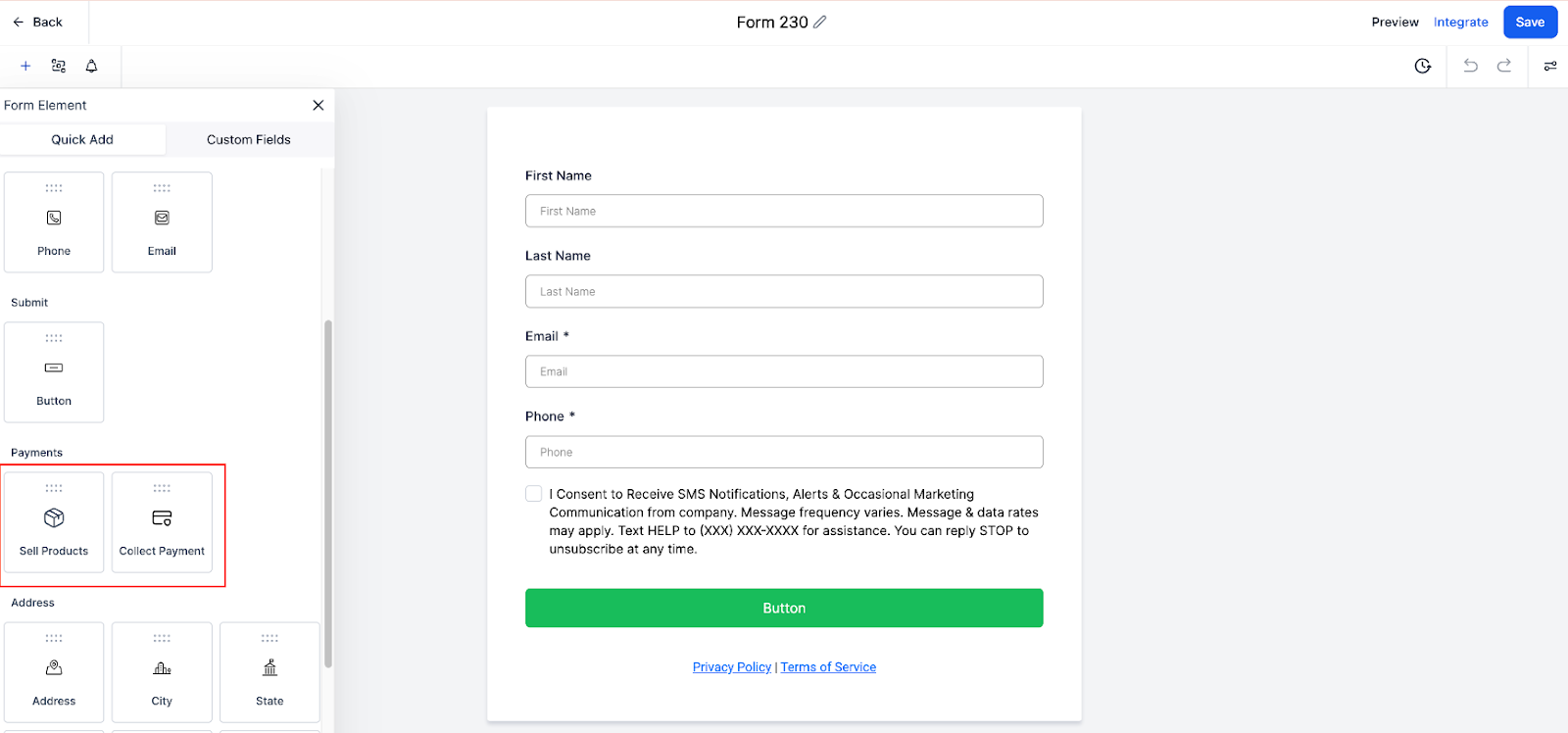
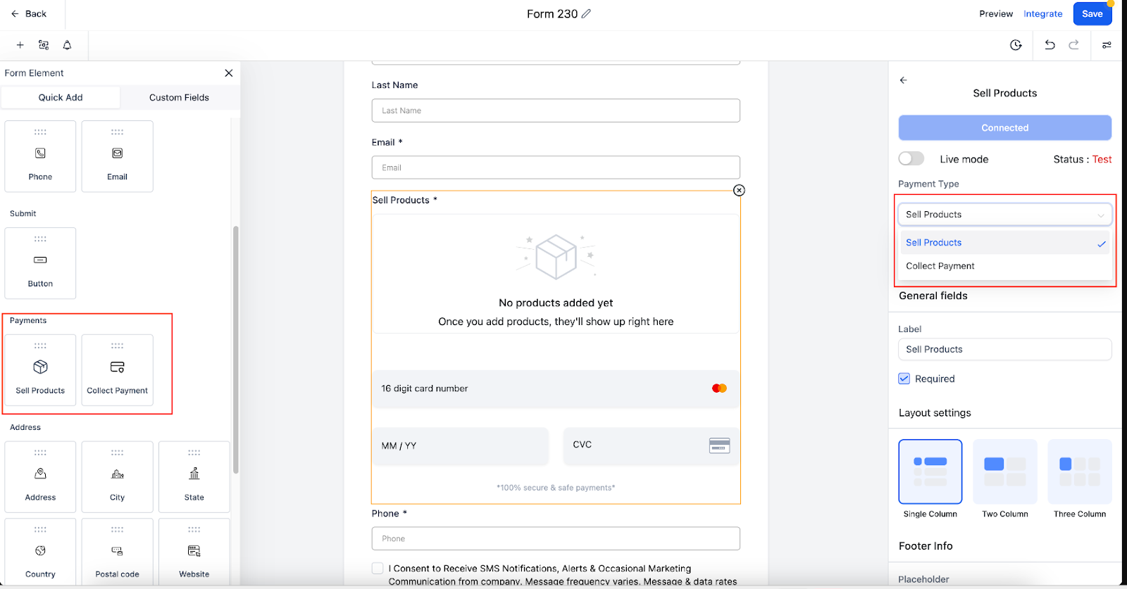
Using Products in Payment Element.
Add Products to Forms: Integrate products directly into your forms using the payment element. This allows you to manage product listings and streamline the purchasing process within the form.
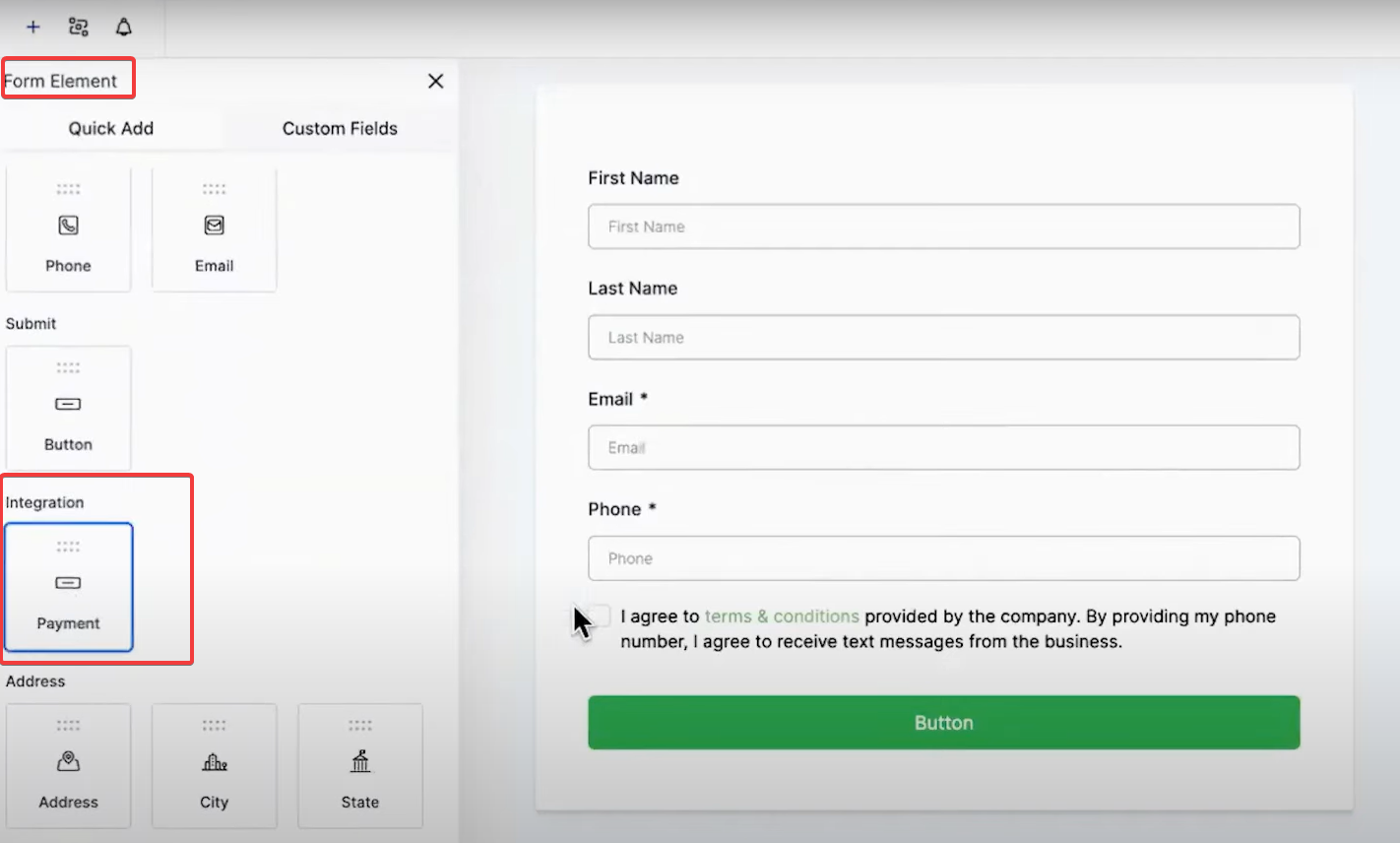
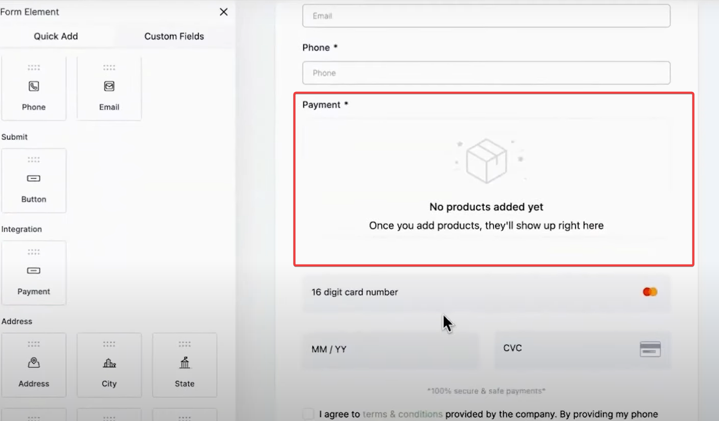
Configuration: Go to the payment settings in the form builder, select the products you wish to include, and customize the display options as needed.
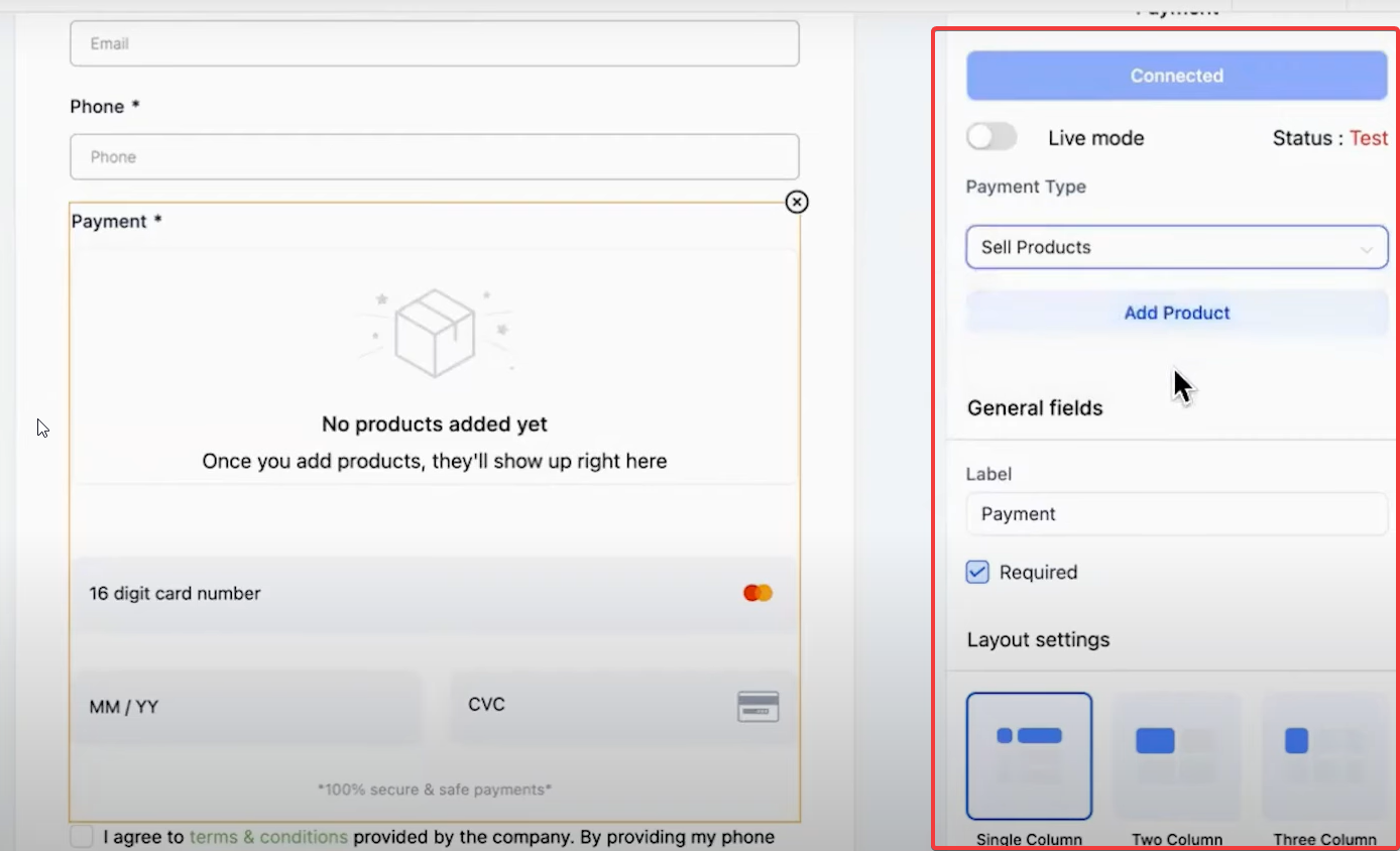
Sell Products: The Sell Products element allows you to sell physical or digital products directly through your forms. It simplifies managing your product catalog and streamlines the sales process.
Collect Amount: The Collect Amount element is perfect for collecting specific amounts of money, such as donations, service fees, or custom payments.
Enhanced UI/UX: The interface has been redesigned for easier navigation and better usability.
Open the Form Builder: Access the Form Builder from your dashboard.
Select the Element: Choose either the Sell Products or Collect Amount element from the new Payment section.
Configure Settings: Adjust the settings to meet your specific needs.
Publish Your Form: Save and publish your form to start collecting payments.
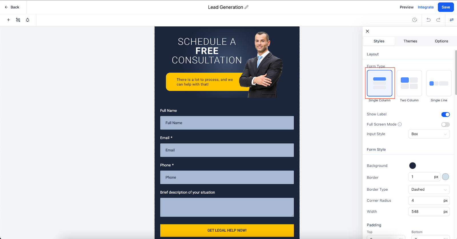
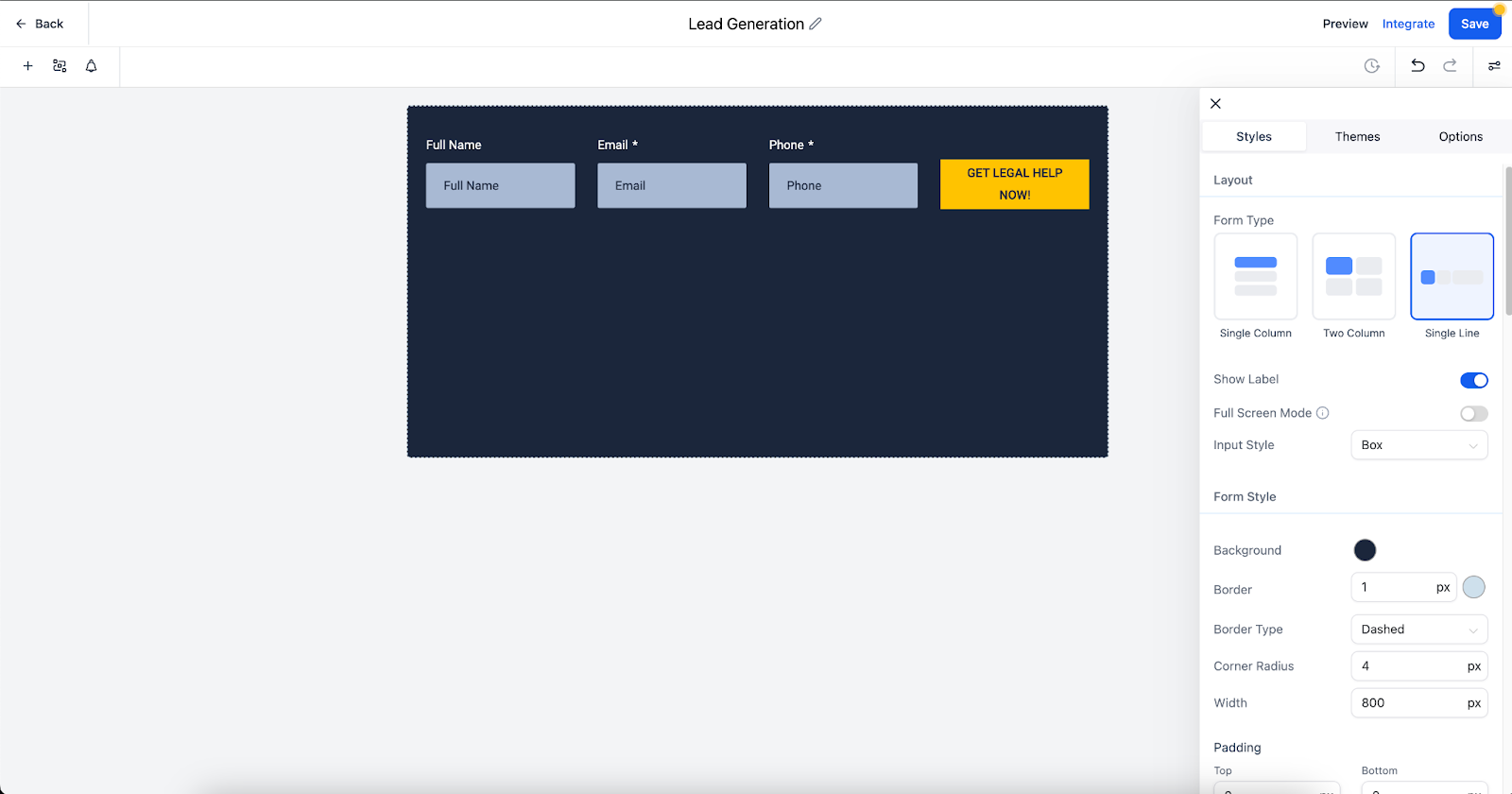
Single Line Forms and Field Width Customization
Single line forms and layout options in the form builder, provide users with greater flexibility and control over their form designs ensuring responsive design and enhancing creativity in form building.

Single Column Layout: Fields arranged vertically, one below the other.
Two Column Layout: Fields placed side-by-side in two columns for a balanced and compact structure.

Single Line Layout: Up to 5 fields in a single horizontal line for a streamlined design.
Field Width Setting: Adjust field widths as a percentage of the form width for tailored and aesthetically pleasing designs.

How to Use: Navigate to the form builder section in your dashboard, select your preferred layout, and use the Field Width setting to customize the size of each field.
Consistency: Maintain consistency in your form design by using uniform fonts, colors, and element sizes.
Accessibility: Ensure your forms are accessible to all users by following web accessibility guidelines.
Testing: Regularly test your forms to ensure they work correctly across different devices and browsers.
A: Yes, custom fonts can be added through the styling options in the form builder.
A: Use the preview feature to test how your form looks on mobile devices and make necessary adjustments in the styling section.
A: Currently, the background image feature applies to the entire form page. Consider using header images or section dividers to add variety.
Add background images and header images to your survey forms to make them visually engaging and encourage higher response rates.
Customize your forms with your company’s colors, fonts, and logos to ensure brand consistency across all user interactions.
Use the payment element to list products directly in your forms, making it easier for users to purchase without leaving the form.
Please Note: