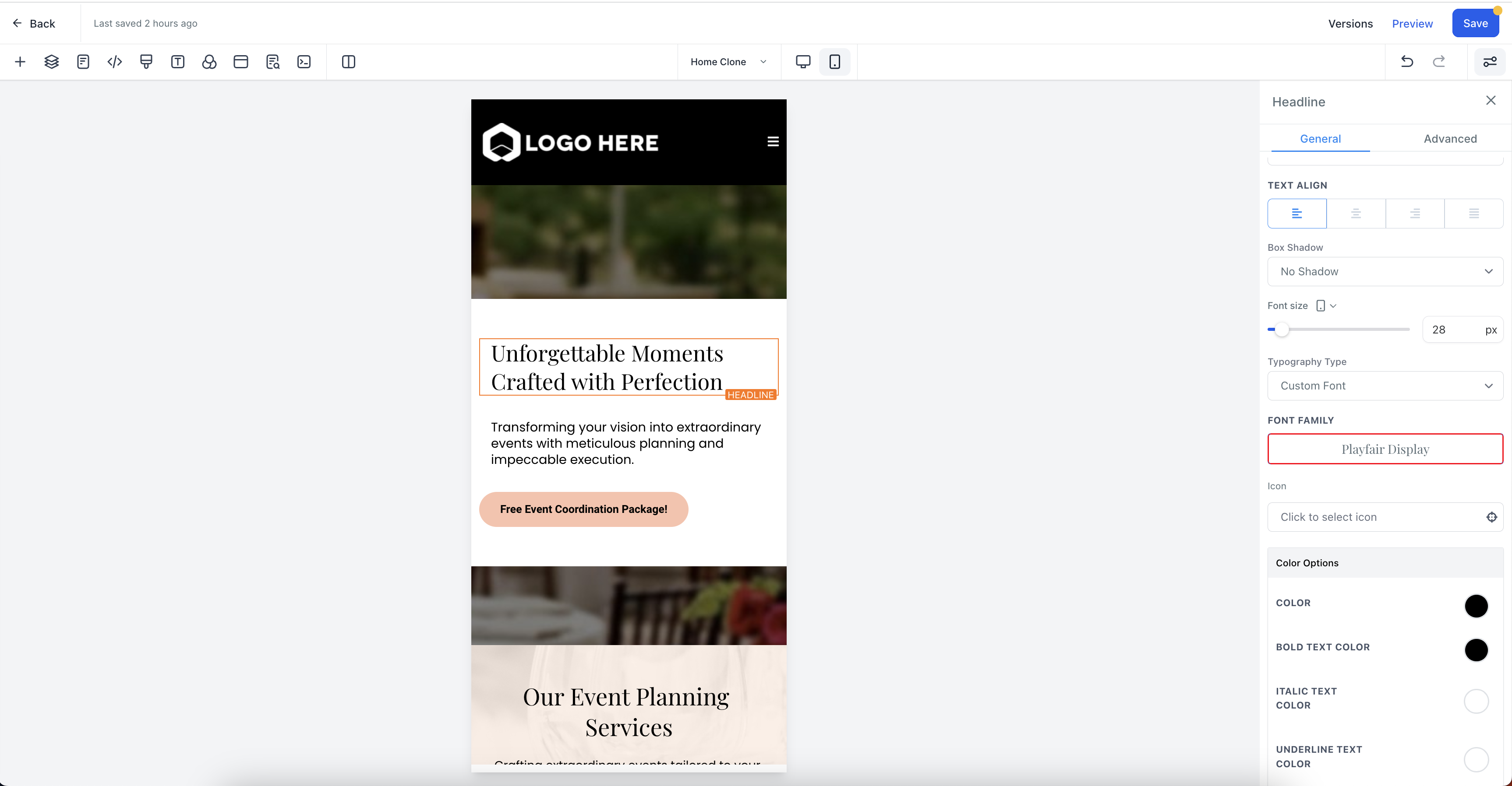
You can click on the desktop icon and change the view from desktop to mobile.
Click on the desktop symbol and changing it to mobile will open the mobile view editor and the changes made in font size in this view will only affect mobile view.
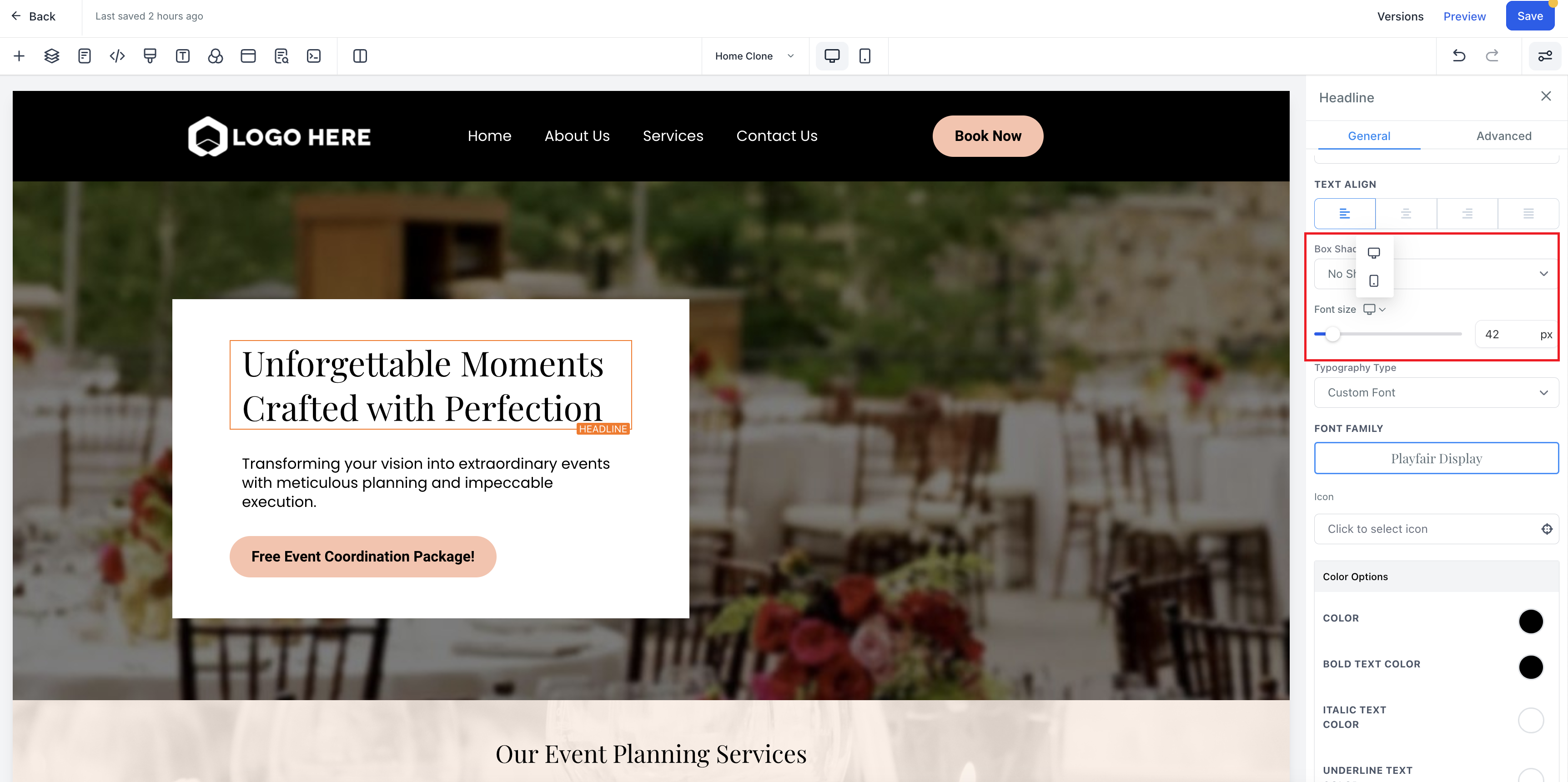
To change the font size of a text element in the new funnel builder and make it responsive across different devices, follow these steps:
Select the desired element in the funnel builder, such as a headline.
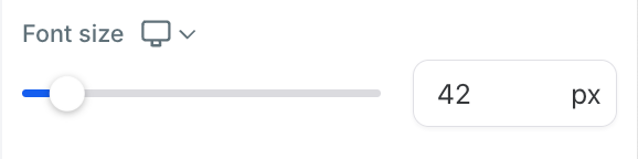
Go to the element settings and navigate to the font size option.
Adjust the font size for desktop. This change will also apply to mobile devices.
Click on the desktop icon to switch to the mobile view.
Change the font size specifically for mobile. Note that this change will not affect the font size on desktop.
To modify the font size for desktop again, switch back to the desktop view and make the necessary adjustments. This change will only affect the font size on desktop.
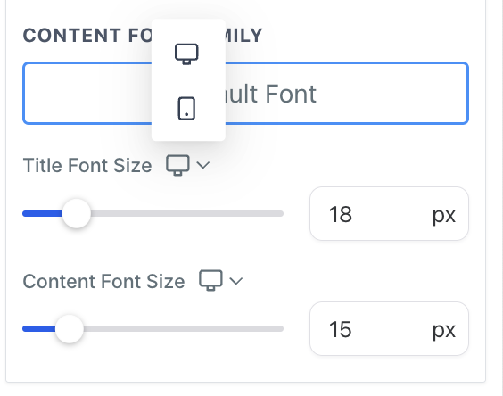
Similar functionality as above. Customization options are there for title and content font size in FAQ element
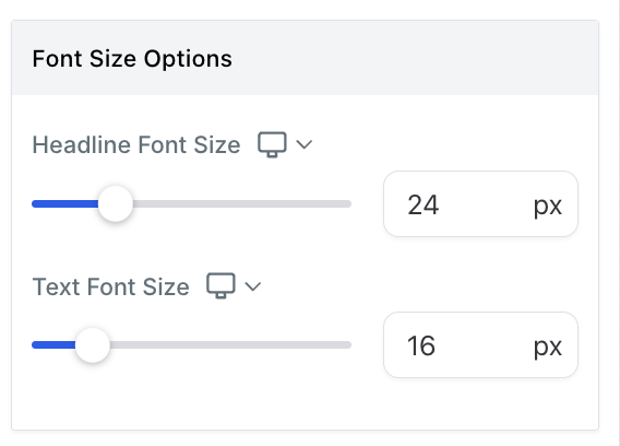
Similar functionality as above. Customization options are there for Headline Font size and Text font size.
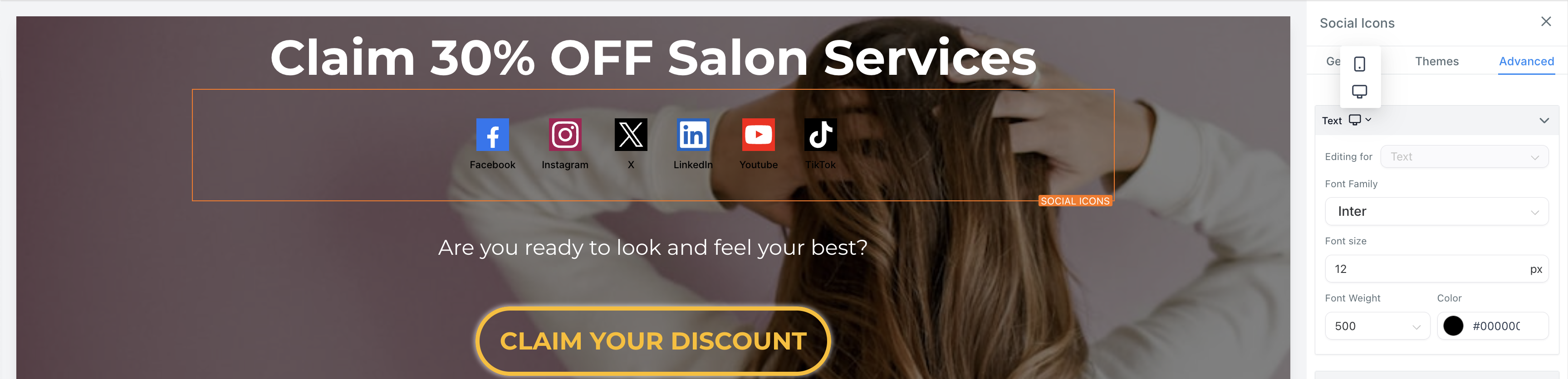
You can see the mobile and web options for social media icons. All the properties of text can be customizable for mobile and web like Font Family, Font size, Font weight, Color. Functionality is similar as above.